How to fix email rendering issues
If you talk about it simply, there are a few major steps that are involved when you want to fix email rendering issues.
Step 1: Identify the problem
The most important part of fixing the problem is identifying it. For this, you need to check how your email is rendering for different devices. This will help you to see what's working and what's not.
Here, you can use Mailmodo to:
- Preview the email to see how your email renders on both desktop and mobile. You can check both HTML and AMP versions of the email here.
- Send test emails to check if anything breaks or doesn’t work in your emails.
Step 2: Fix the issue
Once you've identified the issue, you can move on to solving it. Here are a few common issues that you may come across and you can fix them.
1. Images don’t scale or overlap on mobile
When emails look perfect on desktop but messy on mobile, the issue often lies with how images are sized or how columns behave on smaller screens. Large or fixed-width images can push content outside the viewport, breaking the layout.
What causes it:
- Image width isn't set to scale (should be 100%)
- Columns aren't configured to stack on smaller screens
- Images are too large or misaligned within a fixed layout
Mailmodo allows you to fix this issue quite easily. Check out how:
- Open your template in the Mailmodo editor.
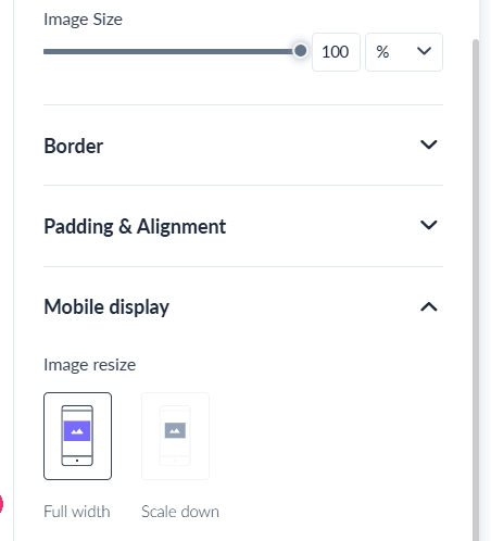
- Click on each image block and check if the width is set to full width under the style panel. Scaling down an image can cause rendering issues.

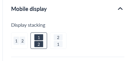
- In case of blocks with images in a multi column layout, use display stacking option under mobile display to ensure columns stack properly on mobile.

Best practices to follow:
- Compress and resize large images for faster load times.
- Add ALT text for accessibility and image-blocking scenarios.
- Always design mobile-first; test responsiveness early.
- Keep image widths at 100 % and constrain file size below 500 KB.
2. AMP content not displaying
AMP components like forms or carousels sometimes fail to appear, leaving subscribers with a static HTML fallback. This usually happens when the email or sender configuration isn’t AMP-ready.
What causes it:
- Your sender email isn’t AMP-approved
- The email exceeds 200KB
- The email is being viewed on unsupported clients (Outlook, Apple Mail)
- AMP syntax is invalid or uses disallowed components
How to fix it:
If you're using Mailmodo, the process is pretty simple. Here's what you need to do:
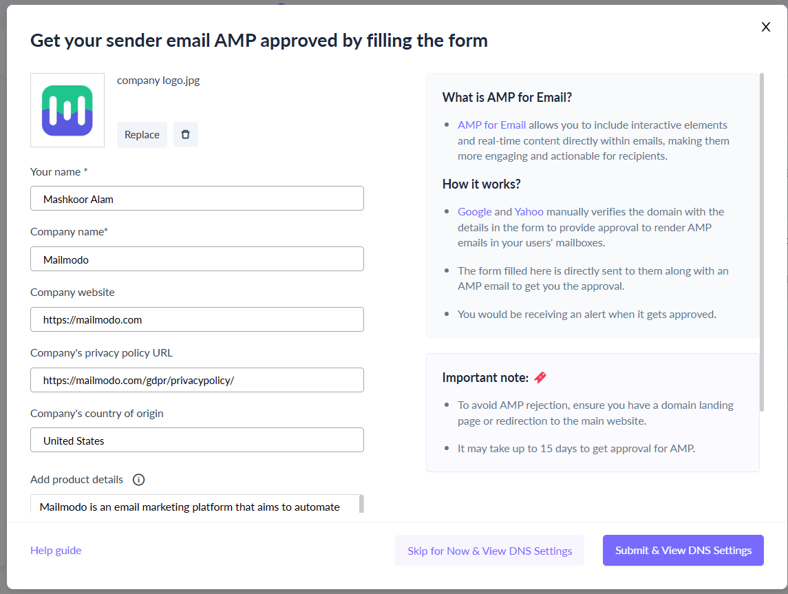
- Go to Settings and then click on AMP Email Setup and ensure your sender email is AMP-approved or get it approved using this AMP approval process. This will get you approved to send AMP emails.

- Keep the email size below 200KB. For this, remove large images or interactive widgets that are causing the email to exceed the size.
3. No optimization for mobiles
Sometimes an email that looks great on desktop appears squished or misaligned on mobile. That happens when responsive behavior isn’t defined in the code.
What causes it:
- Media queries aren’t included in the email
- Your email is built with fixed-width or non-responsive layouts
How to fix it:
If you're using HTML code, ensure you add responsive media queries such as:
 @media only screen and (max-width: 600px) {
  .column { width: 100% !important; display: block; }
 }
You can also skip the entire HTML coding and use Mailmodo’s drag-and-drop editor. It automatically generates media queries so you don’t have to worry about adding responsiveness to your emails.
Best practices to follow:
- Use single-column layouts for simpler readability on phones.
- Use tables for layout instead of
<div> tags.
4. Font and text styling problems
Sometimes your email text looks different across clients — fonts change, spacing breaks, or text alignment shifts. This happens because not all email clients support custom fonts or CSS properties related to typography. Inconsistent font rendering can make your email look unpolished or off-brand.
Root cause:
- Non–web-safe or custom fonts not supported by some clients
- Missing fallback fonts
- Font sizes and line heights are defined in CSS instead of inline styles
How to fix it:
- Stick to web-safe fonts like Arial, Helvetica, Georgia, Times, or Verdana for maximum compatibility.
- When using custom fonts, always define at least one fallback font.
- Specify font size, color, and line-height inline within each text block rather than relying on stylesheets.
Best practices to follow:
- Maintain at least 14 px font size for body text.
- Apply inline CSS for styling instead of using a
<style> block.
- Limit yourself to two typefaces per email for design harmony.
- Use sufficient color contrast (especially for dark mode users).
It becomes much easier to apply these fixes with Mailmodo. The no-code drag-and-drop email builder let you define each aspect of the fonts so you don't have to do it via coding.
Step 3: Test
Once you’ve identified and fixed the issues in your email, the next step is to test your design thoroughly. Testing ensures that every change you’ve made works correctly across different devices, clients, and modes.
Email rendering can be unpredictable. A layout that looks perfect in Gmail might still break in Outlook or on mobile. That’s why it’s important to follow a consistent test → fix → re-test cycle until every element displays as intended.
How to do it:
- Run cross-client previews to test your email in major clients like Gmail, Outlook, and Apple Mail, as well as on Android and iOS devices.
- Make a note of any new spacing, font, or alignment issues that appear after fixes.
- Update the HTML or design settings to resolve those issues.
- Re-test after each round of changes until your email renders correctly across all environments.
- Once everything looks perfect, send a final internal test campaign to validate live rendering.
With Mailmodo, you can design, preview, and test your campaigns all in one place. Use it to spot layout or dark mode issues early, make quick fixes in the drag-and-drop editor, and re-test instantly using its send test email feature. This eliminates the back-and-forth between tools and helps you send pixel-perfect emails faster.
Takeaways
Email rendering issues hurt your campaigns—but they don’t have to. With Mailmodo, you can create responsive, consistent, and AMP-compliant emails that look great in every inbox. No code, no guesswork—just emails that work.
If you’re curious about Mailmodo’s functionalities, book a call with us today or try it out for yourself for Free.


