What causes inconsistent email appearance across devices?
The root of the problem lies in how devices interpret layout, scaling, and structure when rendering your emails. There are multiple reasons why this happens.
Screen size variation: Desktops, tablets, and mobiles have different widths. A layout that fits well on one can easily overflow or collapse on another.
Non-responsiveness: Non-responsive templates don’t adjust or scale based on the screen size, so content either overflows or gets squeezed.
Image inflexibility: Hard-coded image sizes or poor compression lead to stretched, pixelated, or misaligned visuals.
Unoptimized spacing and font sizes: What looks balanced on a large screen may appear cramped or oversized on a small one.
How to maintain a consistent email appearance across devices
There are multiple aspects of the emails that you need to look at when you’re trying to make your email appear consistent across different devices. Mailmodo lets you optimize each aspect of your email so it appears consistent and professional on any device. Let's explore each aspect one by one:
1. Layout

From the Mailmodo dashboard, go to Templates → Pick a template or start from scratch.
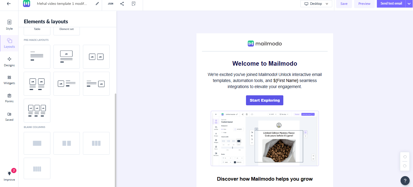
In the Layout tab, select your preferred layout. Mailmodo offers your seven prebuilt layouts, but pick the single-column layout ones for the best cross-device consistency.
2. Images
Depending on your layout, you can add images to various sections of your email, including logos, banners, product shots, and icons.

Here are some best practices to follow:
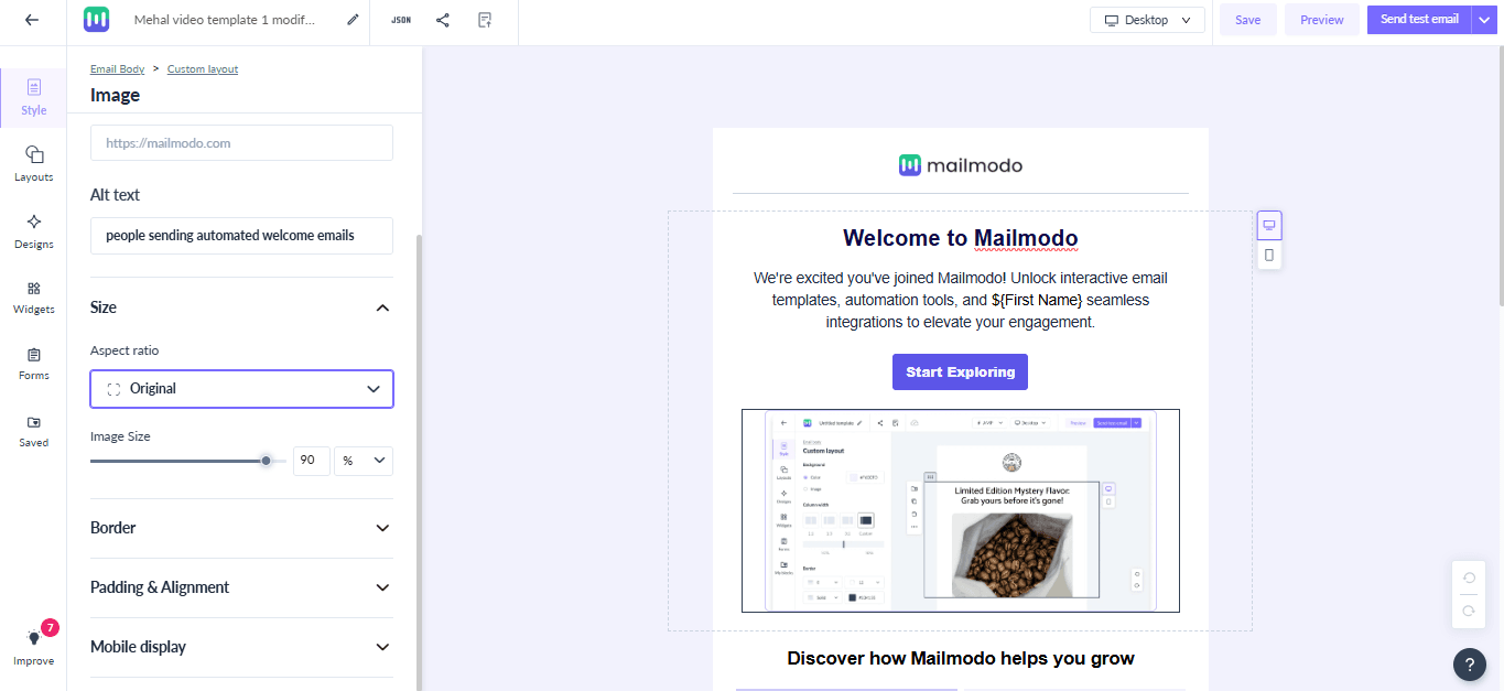
Set image widths to 100% so they scale proportionally on smaller screens.
Maintain correct aspect ratios to avoid stretched or squished images: For example, use square for logos and icons, and landscape for wide visuals.
Use high-resolution images compressed under 500KB to retain sharpness without slowing load times.
Add white outlines around logos or icons for visibility in dark mode.
3. CTA

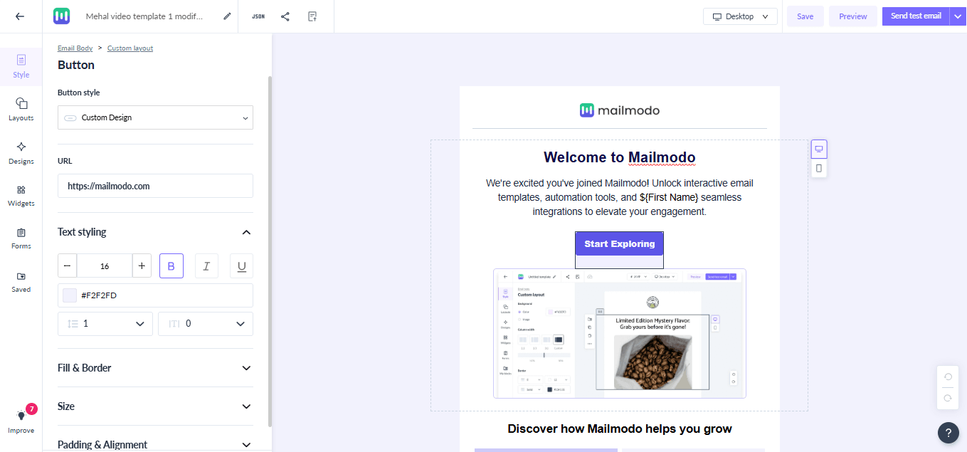
4. Cross-device testing

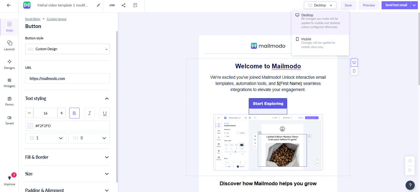
Use the desktop/mobile toggle (icon at the top of the editor) to check how your design appears on both device types.
Send a test email and check it across devices to ensure layout, images, and CTAs appear correctly.
Final thoughts
Creating emails that look perfect on every device may sound technical, but with Mailmodo, you can easily build responsive, professional emails that render flawlessly across screens.
A well-rendered emails boost engagement, clicks, and conversions while giving your readers a smooth, enjoyable experience. Start designing your next email in Mailmodo today and make device consistency a standard for every campaign.


