What do you mean by newsletter layout?
A newsletter layout refers to the design and organization of the content within a newsletter. It dictates how text, images, and other elements are arranged on the page to create an engaging, easy-to-read format.
If you'd like to dive deeper into email newsletters and learn how to get started with one, check out our detailed guide on email newsletters.
💡 Related guide: What Are Email Newsletters and How to Get Started
Why is the newsletter layout important?
The layout of your newsletter plays a crucial role in how your message is received. It’s the visual structure that guides readers through your content, making it easy to digest and compelling to engage with. A well-organized layout can have a significant impact on your email marketing success in the following ways. Here’s what it does:
Captures attention: A visually appealing and structured layout creates a strong first impression, encouraging readers to explore further and stay engaged.
Improves readability: By organizing text, images, and CTAs effectively, a good layout ensures your content is easy to follow and read, keeping your audience hooked.
Reinforces brand identity: Consistent design elements, such as colors, fonts, and logos, help strengthen brand recognition and make your newsletter instantly recognizable.
Boosts engagement and conversions: A thoughtfully structured layout can highlight key messages and CTAs, increasing the likelihood of click-throughs and conversions.
Ensures responsiveness: With a significant number of emails read on mobile devices, a responsive layout ensures your newsletter looks great on any screen, enhancing user experience.
Key components of a newsletter layout
Designing an effective newsletter requires more than just a visually appealing look—it’s about creating a layout that enhances user experience and delivers your message clearly. Every element, from text to images to calls to action, serves a purpose in making your content more engaging and easier to navigate.
Let’s dive into the key components that will help you craft a newsletter layout.
The header is the first thing readers encounter, making it crucial to get right. It typically includes your logo, brand name, a clear subject line, and, if applicable, a navigation bar. A well-designed header not only captures attention but also sets the tone for the rest of the newsletter and reinforces your brand identity. To make the most of your header, focus on:
Brand identity: The logo and brand name in the header help establish immediate brand recognition, ensuring that readers associate the content with your business.
Contact information: Including contact details in the header adds credibility and provides a way for subscribers to reach out if needed. You can also have it in the footer.
Consistency: Maintaining a consistent header design across your newsletters helps create a cohesive brand experience, and your newsletters easily recognizable.

💡 Related guide: What Is an Email Header, With Its Purpose and Components
2. Hero section
The hero section is the first visual and textual element that readers see after the header. It's your chance to make a strong impression by grabbing attention right away, so your most important message in the newsletter goes here. Often featuring a large image or a bold headline, the hero section sets the tone for the entire newsletter and entices readers to keep going. To ensure your hero section is effective, focus on the following aspects:
Visual appeal: A captivating image or striking headline in the hero section immediately grabs the reader's attention, encouraging them to keep scrolling and exploring more of your content.
Relevance: The content in the hero section should be closely tied to the main theme or message of your newsletter, ensuring that it aligns with the interests and needs of your audience.
Clarity: Ensure that the hero content is simple and easy to understand at a glance. It should quickly communicate the value of the newsletter and give readers a reason to continue reading.
3. Body content
The body content is where your main message comes to life. It’s essential to make your content clear, concise, and easy to read, as this is where you convey the core value of your newsletter. To keep readers engaged and ensure they can quickly digest your message, consider the following elements:
Readability: Break your content into easily digestible sections using clear headings and subheadings. Organize the text into columns or grids to avoid overwhelming your readers with long blocks of text.
Hierarchy: Create a logical flow by structuring your newsletter with distinct headings, subheadings, and bullet points. This helps guide the reader through the content, making it easier to navigate and find key information.
Visual breaks: Use images, icons, and whitespace to break up the text and add variety to the layout. These visual breaks help maintain engagement and make the content more inviting to read.
4. Call to action (CTA)
Your CTA guides readers on what action to take next. Whether it's "Shop Now," "Read More," or "Subscribe," your CTA should be prominent, clear, and placed where it’s easy to find. It tells your readers exactly what you want them to do next, whether it’s making a purchase, reading more, or subscribing to a service. To make your CTA as effective as possible, focus on these key points:
Clarity: Use concise, action-oriented language that clearly communicates what you want readers to do. Phrases like “Shop Now,” “Learn More,” or “Subscribe Today” should leave no doubt about the next step.
Placement: Position your CTA where it’s easily visible and hard to miss, usually towards the end of the content. Make it stand out by using contrasting colors or bold buttons that draw attention.
Urgency: Add a sense of urgency to prompt immediate action. Phrases like “Limited Time Offer” or “Last Chance” encourage readers to act quickly, increasing the likelihood of conversion.

Source: Clever Reach
The footer is the final section of your newsletter, providing essential information while reinforcing trust and transparency. It's important to include the following key elements to ensure your newsletter is professional, compliant, and accessible:
Contact and social links: Offer easy access to your contact details and links to your social media profiles. This encourages readers to connect with your brand beyond the newsletter and fosters greater engagement across multiple platforms.
Unsubscribe option: Always include a clear and easy-to-find unsubscribe link. This not only complies with email marketing regulations but also demonstrates respect for your subscribers' preferences.
Legal information: Add any necessary legal disclaimers, including links to your privacy policy or terms of service. This ensures compliance with data protection laws and builds credibility with your audience.
💡 Related guide: What are Email Footers, Elements to Include and Examples
6. Whitespace
Don’t underestimate the power of whitespace! Giving your content room to breathe not only improves readability but also helps prevent your newsletter from feeling cluttered. This balance of text and empty space makes your newsletter more appealing and easier to digest.
Common newsletter layout types
When it comes to designing a newsletter, there are different layout styles you can use, each with its own benefits. Choosing the right layout can significantly affect how your content is perceived and how engaged your readers will be. Here are some commonly used newsletter layouts:

Single column layout: A clean, straightforward layout where all content is stacked in a single column. This layout is ideal for newsletters that focus on a single topic or offer.
Two-column layout: This layout divides the content into two columns, allowing you to feature more information in a concise format. Great for newsletters with multiple articles or different product categories.
Grid layout: It uses a grid of boxes or tiles to organize content. This layout is great for newsletters with a variety of images and short blurbs.
Asymmetrical layout: This layout breaks away from traditional structure, using uneven columns or elements to create a dynamic design. It's perfect for brands that want to stand out visually.
Hybrid layout: A combination of different layouts in one, such as a two-column layout at the top and a single column at the bottom. It’s versatile and allows for varied content presentation.
Design principles for effective layout
Now that you've learned about the key components of a newsletter layout, let's explore the design principles that can elevate your newsletter. Whether you're designing your first newsletter or refining your current strategy, these principles will help you capture attention and create content that resonates with your audience.
1. Alignment
Achieving visual balance and proper alignment is crucial to creating a harmonious layout. Whether you're using a symmetrical or asymmetrical approach, elements should be evenly distributed throughout the design to avoid a lopsided or cluttered appearance.
2. Hierarchy
Establish a clear visual hierarchy for guiding readers through the content. Use typography, font sizes, colors, and spacing to emphasize important elements such as headings, subheadings, and key information.
3. Whitespace
Also known as negative space, white space refers to the empty areas around design elements. It provides a visual breathing room, allowing users to focus on the essential content without feeling overwhelmed.
4. Color and branding
Consistent color schemes and branding elements contribute to a cohesive and memorable design. Colors should reflect the brand's identity and evoke appropriate emotions or associations in the audience. A well-chosen color palette enhances recognition and helps establish a strong brand presence.
5. Responsive design
With the increasing variety of devices and screen sizes, responsive design is essential. Ensure your layout adapts seamlessly to different screen resolutions, orientations, and devices, providing a consistent and user-friendly experience.
Best practices for newsletter layout
Optimizing how your content is placed in a newsletter can make all the difference in how effectively you communicate with your audience. Here are some proven practices to ensure your content is strategically positioned for maximum impact.
Above-the-fold visibility: Position essential elements like headlines, key offers, and CTAs within the top portion of the newsletter (the area visible without scrolling). This ensures readers immediately see your most important messages.
Logical section organization: Structure your newsletter with clear sections that align with the natural reading flow. Start with a compelling introduction, followed by the main content, offers, and conclude with a clear CTA. This ensures a seamless user experience.
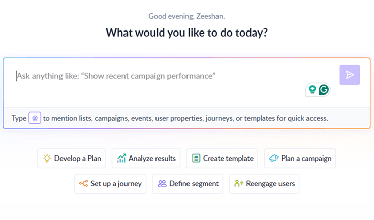
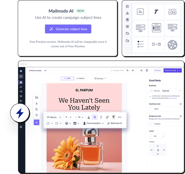
Use templates generated by AI: With Mailmodo’s AI Template Generator, you can simply type a prompt like “Create a newsletter layout for a product launch with a hero banner, three content blocks, and a CTA at the end.” The tool instantly generates a ready-to-edit template optimized for all screen sizes, helping you save time and focus on refining your message.

Your AI Assistant for Everything Email Marketing
- Use interactive elements: Adding interactive elements like buttons, accordions, or quizzes can increase reader engagement. Interactive widgets encourage subscribers to spend more time on your newsletter and can even boost conversion rates.
Wrap up
To wrap up, your newsletter layout is the stage for an unforgettable performance. Every element—whether it's a bold headline, a captivating image, or a well-placed call to action—serves as a scene in a story that draws your audience in.
By carefully crafting your layout with the right design principles and optimization techniques discused in this article, you’re not just sending a newsletter; you’re creating an experience that resonates with your readers. So, whether you're aiming to inform, engage, or convert, a well-thought-out layout is your secret weapon for making every newsletter a showstopper.