- Platform

- Resources
Learn Marketing

Guides

Email Templates

Email Flows

Ebooks & Reports

Marketing Videos

Newsletter
See More Resources ->
Free Tools
Email Marketing 101 FREE
Read Now ->

Mixpanel's Email Design System
Mixpanel is a product analytics tool for capturing data on user interaction with digital products.


Email design system
TemplateAesthetics
AnalyticalSubmitted by
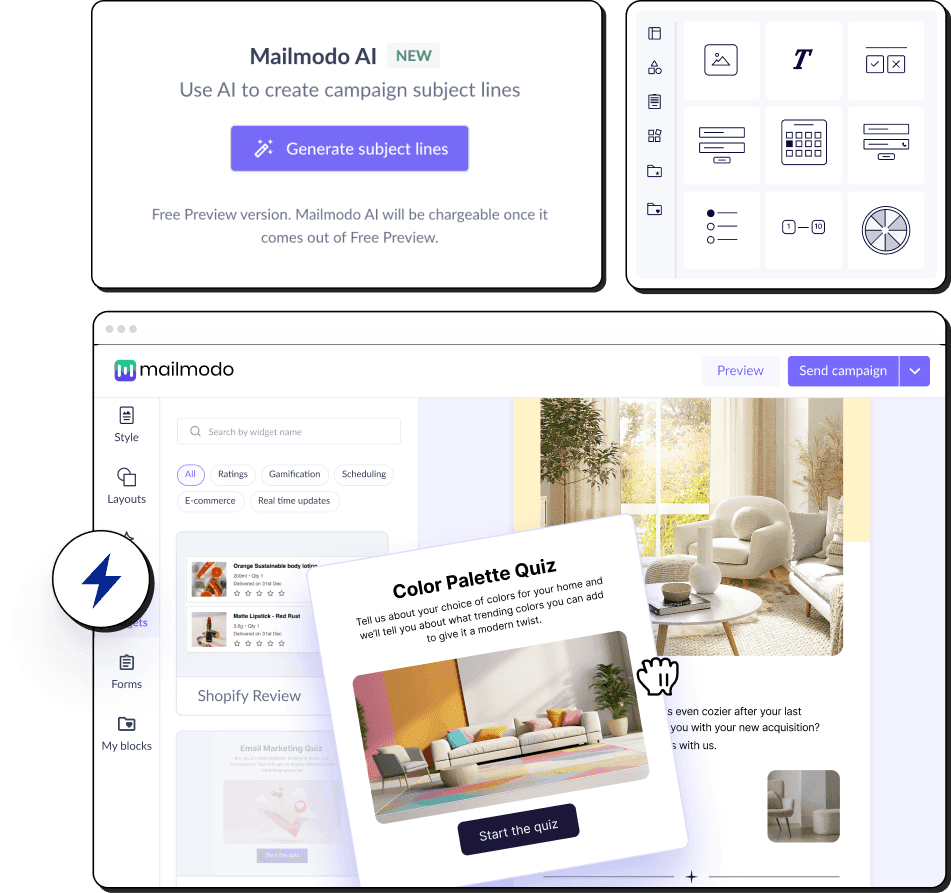
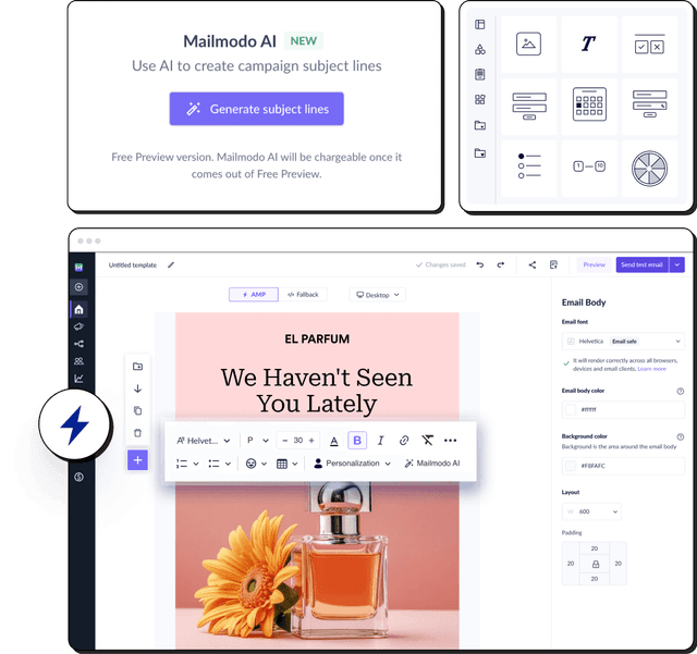
Mailmodo


Color
Create impactful experiences and convey brand identity through color.
Primary color
By using a consistent set of primary colors in email design, the brand can be easily recognized and remembered by the recipient. All secondary colors used should be derived from this gradient.
Secondary colors
Secondary colors can be used to add depth and dimension to the email design by creating contrast and highlighting certain elements. A different secondary color should be used for the header, footer, and main body of the email to differentiate the sections..
Typeface
Typography plays a crucial role in presenting design and content in a clear manner.
Font family
Helvetica Neue, Arial, Helvetica, Times, Apercu Pro, sans-serif
Primary font


Headlines & Paragraph
Secondary colors can be used to add depth and dimension to the email design by creating contrast and highlighting certain elements. A different secondary color should be used.
| Example | Size | Line height | Weight | Letter spacing |
|---|---|---|---|---|
| H1 | 32 px | 1.5 em | Medium | 0 px |
| H2 | 18 px | 1.5 em | Regular | 0 px |
| H3 | 1.5 em | Regular | 0 px | |
| H4 | 1.5 em | Regular | 0 px | |
| Paragraph | 14 px | 1.5 em | Regular | 0 px |
💡 Use different font sizes and weights to create a visual hierarchy that guides the reader.
⚡️ Use a regular or light weight font for the body text to ensure that it's not too heavy and doesn't create visual clutter. Don’t forget to have appropriate letter spacing to ensure that the text is easy to read.
Buttons
Test the placement, color, and text of your buttons to encourage recipients to take action.
Button Type 1


Blocks/ Modules used
Stick to a consistent layout throughout the email to make it easier for recipients to follow the content.
Email width
650 px
Button Type 1


Header block/module
Use a clear and legible font for the logo and navigation links in the header block and keep it uncluttered.
Header Block


Footer block/module
Include physical address, email address, and social links to make it easy for recipients to contact you.
Footer Block


Templates
Before designing your email template, identify the purpose of the email and the brand messaging.


Get 3X email conversion
with Mailmodo

Create & send interactive emails without coding
Put revenue on auto-pilot with pre-built journeys
Save time with AI-powered email content creation
Experience world’s only interactive email marketing platform
Trusted by 10000+ brands