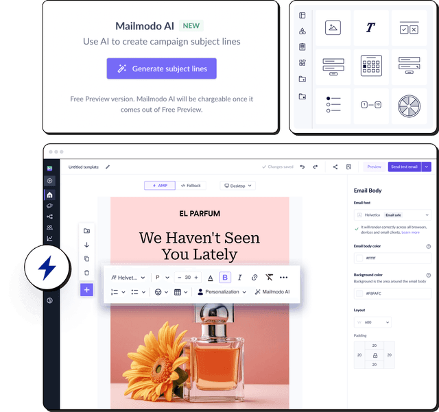
1. Mailmodo

A SaaS company’s marketing team was struggling with low response rates on their customer feedback surveys. The problem? Their emails contained a link that redirected users to an external survey page and most recipients simply didn’t bother clicking through. The team needed a more engaging, frictionless way to collect responses.
Strategy
Version A (Control): A standard email with a “Click Here to Take Our Survey” button linking to a separate survey page.
Version B (Variant): An interactive AMP email built with Mailmodo, allowing users to complete the entire survey right inside their inbox — no extra clicks or loading pages.
Outcome
The interactive email Version B achieved a 257% increase in survey completions compared to the static version. The result proved how eliminating friction and enhancing interactivity can dramatically improve user engagement and data quality.
2. Zalora – Building trust, boosting checkouts

Zalora's retailer noticed that even with heavy web traffic, too many shoppers were leaving before checking out. Their team suspected that customers weren't confident enough in the value and security of buying, especially around topics like returns and delivery.
Strategy
Version A (Control): Standard layout with “Free Delivery” and “Free Returns” info buried in small print.
Version B (Variant): Prominent trust badges and banners highlighting “Free Delivery” and “Free Returns” placed near the “Add to Cart” button.
Outcome
The trust-focused version increased checkout rates by 12.3%, proving that addressing customer anxieties at the point of purchase builds confidence and drives conversions.
3. Amazon – The color that sold millions

Amazon, one of the world’s largest e-commerce platforms, constantly experiments to improve user experience and boost sales. Even small design changes can have a massive impact due to its enormous customer base. One such test focused on the “Add to Cart” button, a critical element in driving conversions.
Strategy
Outcome
The orange button led to a 1% increase in clicks, a seemingly small lift that translated into millions in extra revenue due to Amazon’s massive user base.
4. Google – The 41 shades of blue
 Google’s design team is known for its attention to detail, constantly refining the user interface to maximize engagement. Even the smallest visual elements can influence user behavior, which is why Google conducted a meticulous experiment on the color of ad links.
Strategy
Outcome
The winning blue shade increased engagement so much it generated $200 million more revenue per year, showing how even subtle design details can impact performance.
5. Bannersnack – The bigger, better CTA

Bannersnack, a design tool platform, wanted to increase sign-ups on their landing page but noticed very low conversion rates. Using heatmaps, they discovered that users were overlooking the CTA button entirely, making it clear that visibility was a major issue.
Strategy
Version A (Control): Small, low-contrast “Sign Up” button blending into the background.
Version B (Variant): Larger, brightly colored CTA button with more contrast for better visibility.
Outcome
The new CTA design led to a 25% increase in sign-ups, showing how visual prominence directly influences conversions.
6. Grene – Redesigning the mini cart

Polish retailer Grene identified that many customers dropped off after adding items to their mini-cart. Investigation revealed that users struggled to find totals and checkout buttons, creating friction in the purchase process
Strategy
Version A (Control): Cluttered mini-cart with small “Go to Cart” button and hidden item totals.
Version B (Variant): Redesigned mini-cart featuring a large top CTA, clear item totals, and easily visible “Remove” options.
Outcome
The improved mini-cart doubled purchase quantities and raised overall conversion rates, providing clarity and usability to drive more completed purchases.
7. Harry’s – Turning confusion into action

Harry’s, a grooming products brand, had a homepage that attracted good traffic but generated low sign-ups. The team suspected that their vague CTA “Learn More” was leaving users unsure of what action to take next.
Strategy
Outcome
Conversions rose significantly, showing that clear and direct CTAs outperform vague ones by reducing uncertainty.
8. Miller & Smith – Diagnosing before testing

Real estate developer Miller & Smith faced low engagement despite having an attractive site. They weren’t sure where users were struggling, which made it difficult to prioritize improvements.
Strategy
Outcome
Engagement increased, bounce rates dropped, and conversions improved highlighting that data backed UX adjustments amplify testing success.
9. Airbnb – The power of high-quality images

Airbnb noticed that many property listings were getting high impressions but few bookings. Their team suspected that low quality photos were discouraging users from finalizing reservations.
Strategy
Version A (Control): Listings with user-uploaded, low-quality photos.
Version B (Variant): Listings with professionally shot, high-resolution photos provided by Airbnb’s photography program.
Outcome
The listings with professional photos received significantly higher booking rates — in some cases, up to 2x more reservations. This experiment showed that visual quality and trust signals have a direct impact on user decisions and conversions.
10. Ubisoft – Copy that connects

Ubisoft aimed to increase sign-ups for their gaming newsletters but noticed that their lead forms felt generic and unengaging. Users weren’t connecting with the content, reducing overall conversions.
Strategy
Version A (Control): Generic headlines like “Sign up for updates.”
Version B (Variant): Emotionally engaging copy emphasizing exclusivity and community: “Join the Community. Get Early Access to Game Drops.”
Outcome
Lead sign-ups increased by 12%, demonstrating that emotionally resonant language can create stronger user connection and drive action.
Conclusion
As the examples show, A/B testing isn't just about finding a "winner"; it’s a culture of continuous improvement. From refining a CTA button's color to simplifying a complex checkout form, every test provides valuable insights into user behavior. This knowledge empowers businesses to make informed decisions that reduce friction, enhance the customer experience, and increase ROI over time.
The case studies presented demonstrate the power of systematic experimentation across various business functions. Whether you're optimizing an email subject line with Mailmodo or validating a website redesign, the process is the same: research, hypothesize, test, and iterate. By adopting an "Always Be Testing" mindset, you can build a more resilient and responsive strategy, ensuring that every change you make is a deliberate step toward success.