Leading with a Clear Value Proposition
A clear value proposition tells visitors who you are, what you offer, and why it matters to them, all within seconds of landing on your page.
Businesses that keep this message consistent across every customer touchpoint, from the homepage to email to checkout, grow 60% faster than those with scattered or vague messaging
That growth comes from trust. When people understand your offer immediately, they spend less energy figuring you out and more energy deciding to buy, shortening the path from first click to conversion.
Building this clarity starts with a single sentence naming your audience, your offer, and your outcome:
Skip industry jargon and clever wordplay.
State plainly who you help and how you help them.
Place this statement above the fold on your homepage.
Echo the same core message in your ad copy, product pages, and onboarding emails.
Consistency turns a slogan into a promise customers can recognize anywhere they encounter your brand.
Take a look at how a thriving brand accomplishes this method:
Business For Sale, an Australian marketplace connecting buyers and sellers of businesses across the country, is a great example.
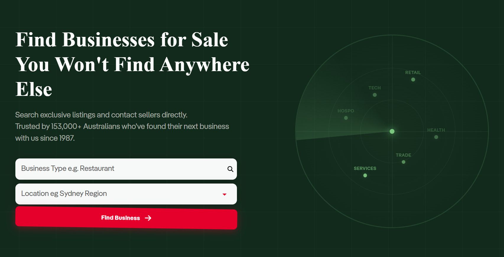
Their homepage opens with a bold, direct statement that they help visitors find businesses for sale that aren’t listed anywhere else. This message sits front and center, above the fold, so it’s the first thing any visitor reads.
Supporting text builds on that promise, mentioning exclusive listings and direct contact with sellers, then adds a trust marker that over 153,000 Australians have used the platform to find their next business since 1987.
This combination of a sharp value proposition and quick proof gives visitors a reason to keep exploring instead of bouncing to a competitor.
Source: businessforsale.com.au
Turning Your Process Into Content
People trust what they can picture. When a business shows its process step by step, visitors stop wondering what happens after they click “buy” and start feeling ready to commit.
This tactic works because it replaces guesswork with a clear map, turning an abstract service into something visitors can walk through in their minds before they ever pay for it.
To put this into practice:
Break your service down into its real stages, not a marketing version of them.
List what happens first, second, and so on, using plain language that a first-time visitor would understand.
Keep each step short – one action, one outcome.
Pair the steps with simple icons or illustrations so visitors can scan the process in seconds rather than read a wall of text.
Place this section after you’ve explained your core offer, so it reinforces the pitch instead of replacing it.
A brand that puts this into practice well is Start in Wyoming, a service that helps entrepreneurs form Wyoming LLCs and handles registered agent duties on their behalf.
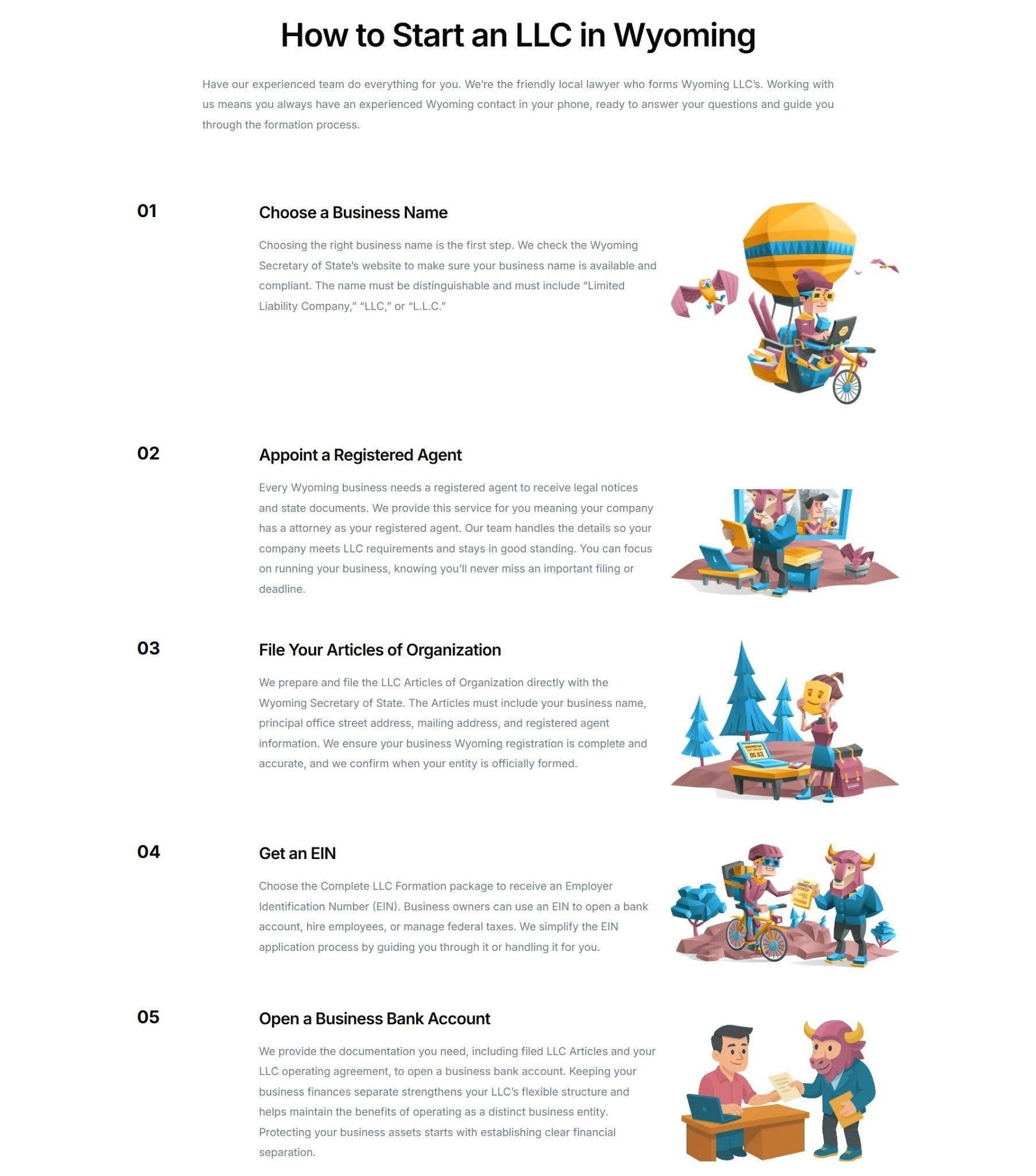
After laying out their service and what customers receive, their homepage walks visitors through a five-step process. Each step spells out exactly what happens, starting with checking name availability and appointing a registered agent, through filing the Articles of Organization, and on to final confirmation once the state approves the paperwork.
Clean illustrations accompany each stage, making the whole formation process feel approachable rather than intimidating.
A task that sounds like paperwork and legal complexity suddenly reads as five manageable steps. This builds the confidence customers need to sign up rather than close the tab and look elsewhere for a simpler option.
Source: startinwyoming.com
Building Trust Through Authentic Customer Stories
Buying a product you can hold and test is one thing. Committing to a service, an investment, or a major purchase you can’t touch first is another.
In that space between interest and commitment, people look for proof. When customers can’t inspect something directly, evidence from other people, other brands, or outside reviewers lowers the perceived risk of making the wrong call
Authentic customer stories fill that space better than any feature list or benefit statement ever could.
To use this tactic well:
Collect stories that sound like the people who told them.
Skip generic, vague praise like “great service” and ask customers what problem they had, what almost stopped them from buying, and what result they got.
Include a name, a professional photo, and a role or title whenever you can, since specificity builds credibility faster than a polished quote ever will on its own.
Place these customer stories near the decision points on your site, right where customers are weighing whether to commit.
CapitalPad, a private equity co-investment group that lets individuals invest in lower middle market acquisitions, applies this well.
After explaining what the firm does and how members benefit from deal-by-deal access, their homepage features testimonials from real investors describing their experience in their own words. Each quote appears alongside a headshot and the person’s business title, turning an abstract pitch about deal access into a specific account from someone with real stakes in the outcome.
For a category built on trust, transparency, and careful due diligence, this kind of visible, attributed proof does real work in moving a visitor from curious to convinced.

Source: capitalpad.com
Helping Buyers Compare Options with Transparent Content
Shoppers rarely buy the first option they see. They open five tabs, weigh features against price, and try to figure out which choice actually fits their situation.
A brand that does this comparison work for shoppers, honestly and clearly, saves them time and earns trust in the process. Hiding your weaknesses only pushes people to a competitor’s comparison page instead, where you have no control over how you’re described.
To put transparent comparisons to work:
Build a simple table that stacks your offer against the realistic alternatives your buyers are already considering.
Cover the details that actually drive a purchase decision, such as core features, pricing, setup time, and support.
Be honest about where a competitor wins. This honesty makes the categories where you win far more convincing, since customers can tell the table isn’t rigged in your favor.
Place it where buyers are already comparing, not buried on a separate page they might never find.
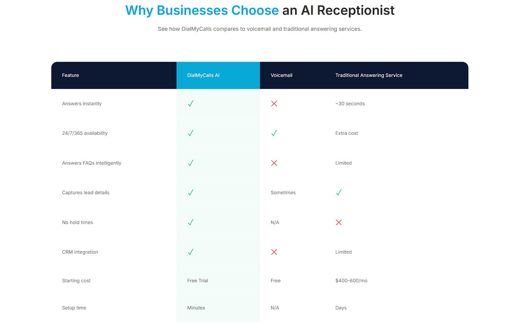
DialMyCalls, a mass text messaging and business communication platform that also offers AI-powered call handling, applies this well on the landing page for its AI Receptionist & Phone Answering Service.
The page lays out how the AI answering service compares to traditional answering services and voicemail, covering features, pricing, and setup time in a clean table that scores each option side by side. Traditional services often mean higher monthly costs and a slower setup process, while voicemail offers no real conversation at all, just a recorded message that callers may never leave.
Seeing all three side by side gives visitors a fast, clear reason to choose DialMyCalls over the alternatives, without reading paragraphs of marketing copy to reach that conclusion.
Source: dialmycalls.com
Anyone can claim to be a leader in their field. Numbers make that claim harder to dismiss. A brand that puts its scale, reach, and recognition on display gives visitors a fast, tangible reason to believe the pitch that came before it.
This kind of proof works because it moves the conversation from what a company says about itself to what it has actually achieved and delivered. Its results are measured in figures that a skeptical visitor can quickly verify or at least take seriously.
To apply this to your own brand:
Pull together the numbers that best represent your scale and reliability, such as customer count, countries served, data processed, uptime, or years in business.
Choose figures that are specific and easy to grasp at a quick glance, not vague claims like “trusted by thousands.”
Pair these stats with any awards, certifications, or press recognition you’ve earned.
Place this section high on your homepage, right after your value proposition, so visitors see the proof before they’ve had time to doubt your offer.
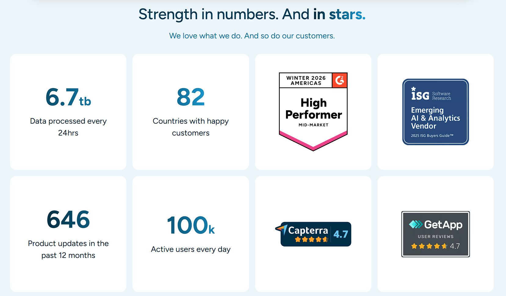
Klipfolio, a cloud-based business intelligence platform that pulls raw data from multiple sources into customizable dashboards and reports, puts this into practice on its homepage.
A dedicated section highlights the platform’s scale through quick, scannable metrics, showing how many countries its customers span, how many people use the platform daily, and how much data it processes each day. Alongside these numbers, the page displays awards and recognition badges the company has earned.
Together, these elements turn abstract claims about reliability into concrete, checkable facts. This gives customers instant reassurance that they’re choosing a platform other serious businesses already trust and depend on daily.
Source: klipfolio.com
Final Thoughts
Brand awareness gets people to notice you. Strategic content gets them to act.
The five tactics covered here – clear value propositions, transparent processes, real customer stories, honest comparisons, and visible proof of performance – all share one goal. They remove friction between a customer’s first impression and their final decision.
None of these tactics works in isolation. A persuasive value proposition means little without the trust that customer testimonials build. Comparison tables don’t do much without the credibility that genuine numbers provide. Together, they form a system where every page answers a question before the visitor has to ask it.
So, start small. Pick the section your homepage handles worst, apply one tactic, and measure what changes. Content built this way converts that attention into customers who already trust you before they’ve spoken to anyone on your team.