What is email design?
Email design refers to the overall design of an email that includes the overall layout of the email, color schemes, placements of images, content, links, and CTAs with the goal of making the email look visually appealing and increasing engagement.
For example, when decorating a home, an interior designer looks for the dimensions, color schemes, layout, arrangements of furniture, wallpics, and much more. Email designing is exactly like that, where you select the right fonts, colors, images, and layouts to increase engagement and click-through rates. Effective email design captures attention and conveys messages clearly.
Why does the design of the email matter?
No matter how compelling a copy you have written, no one will read it if it doesn’t look good. People who open your email and see bad design elements will avoid reading further. This will impact your engagement rate and leave a bad impression on the reader.
That's why the design of the email matters. It strengthens your copy by giving it a visually appealing look and inviting readers to engage with it.
Email design components
There are some email design components that you need to keep in mind to make the email look more engaging and attractive to users. If you want to know more about the below components, check out this guide about email design system.
| Components |
Meaning |
| Alignment |
Alignment of different elements in the email. Elements can be left-aligned, center-aligned, and right-aligned. |
| Border width |
The width of the four sides of an element’s border. |
| Border radius |
The roundness of the corners of an element. The higher the radius value, the more rounded the corners of the elements will be. |
| Padding |
The space inside an element, such as a button, text box, or image container, that creates breathing room between the content and its border. The value of padding remains in pixels (px). |
5 Crucial elements of an email design
Let's discuss essential components of an email that must be designed well to ensure better engagement and interactivity.
1. Email layout
The layout structures your email content and creates a flow of information as the reader moves from one section to the next. The more scannable your email will look, the more the readers will be tempted to read it. That's why you need to get the email layout right.
You can choose from a variety of email design layouts, such as:
| Single-column layout |
Multi-column layout |
| Inverted pyramid layout |
Zig-zag layout |
|
Hybrid layout |
Here's a visual representation of these email layouts:

Check out the most common components in an email layout:
Pre-header: It's the part that comes before the main email header and usually contains the brand logo, navigational links, or view in browser link.
Top fold/hero: This is the part visible to the reader on their screen without scrolling. This part should capture the attention and compel readers to either click on the CTA (if it's in the top fold) or scroll further.
Email footer: The email footer is the bottommost part of the email and often contains information like the social share button, unsubscribe button, link to the privacy policy, company information, etc.

💡Recommended email layout: Single or inverted email layout
We recommend the single-column layout because it makes your email accessible to everyone and creates a better reading experience. Besides, more and more people view their email on mobile, so it makes perfect sense to use a single and inverted email because they look good on mobile devices.
2. Typography
One of the important aspects of typography is fonts. Typically, fonts can be categorized as email-safe fonts and web-safe fonts.
Email-safe fonts are pre-installed on an email recipient's device, and the chances of it not rendering in an email are very low. Examples include Arial, Times New Roman, Georgia, etc.
On the contrary, web-safe fonts are installed on operating systems, but there’s a higher chance that the font may not render properly if the recipient’s device doesn’t support it. Examples include Helvetica, Comic Sans MS, Calibri, etc
If your brand personality is classic and traditional, opt for fonts like Times New Roman or Helvetica. However, use fonts like Comic Sans MS if your brand style is fun and youthful. Browsing current font trends can also spark ideas for typefaces that feel fresh while still being compatible with major email clients.
As the reader often scans the email, you can leverage the font styles, weight, size, and color to create anchor points, taking the reader's attention from the most important to the least.

Check the readability
Apart from the written text, how the text shows up in the recipient's inbox impacts the readability. That's why you need to keep an eye on the readability of the content in addition to typography.
The font size and weight should be such that the readers can read the content without much effort or strain on their eyes. The text color should contrast with the background to ensure readability and enhance visual clarity for the recipients.

💡Recommended font size: 14px-18px and headline between 20-36px
3. Imagery
The imagery makes your email more appealing. It's your chance to show your brand value by adding your image assets, such as graphics, logos, banners, etc.
But, you cannot add an image and call it a day. A good email design considers everything, such as image file type, the load time of the images, accessibility, and types of images to add.
Image format
If you use static images, PNG and JPEG are the best formats.
For animated images, we recommend using GIFs or APNGs.
Image size
Images form a major chunk of the total email size. So, try to keep their size as low as possible by compressing them. You can use design softwares like Adobe Photoshop or online free tools such as TinyPNG and TinyJPG to reduce the image size. Using a photo auto editor can help handle repetitive image adjustments more efficiently while keeping visuals consistent across different email formats.
Email images often need different sizes for various layouts, making manual adjustments time-consuming and error-prone. With insMind, you can simplify this process using its AI Expand feature. Instead of cropping or distorting visuals, it intelligently resizes images into predefined aspect ratios such as 3:4, 1:1, or custom sizes.
💡Recommended image size: Less than 1MB
Iconography
Along with images, you can add icons to make email content visually attractive such as social media icons. Icons help illustrate list items, steps, or processes, create a visual hierarchy, and work as anchors such as arrows.
While adding icons, make sure they support the text, if you're using them next to text.
One thing to remember while adding images is not to use generic images that don't add value. Images should be relevant to the email copy. Also, if you're downloading stock images, consider editing images, licensing and copyright. Add images only after obtaining permission from the source. If you’re looking to design marketing assets beyond emails, like event promos or product highlights, a flyer maker can be a quick way to create branded visuals that match your email campaigns.
Buttons in email design are interactive elements (usually styled as clickable call-to-action buttons) that encourage users to take a specific action.
Ask yourself these questions before adding a CTA button:
Should the CTA have rounded or square edges?
Where should the button be placed?
What color should the button be?
Is there enough padding inside the button?
The CTA can further be divided into two categories:
1. Primary CTA buttons
The main action you want the recipient to take. So, it should be placed in a prominent position and must be visible at once to the reader. Since it represents the key goal of the email, there is usually only one primary CTA to avoid overwhelming the reader.
2. Secondary CTA buttons
Any action you want users to take apart from the main action would be considered secondary. It is typically less visually dominant and placed in a way that complements rather than competes with the main CTA.
You must distinguish the secondary CTA from the primary to not divert the user's attention from the primary action. You can do this by:
Using a lighter color than the primary CTA
Using a different button design
Using a smaller button size than the primary CTA
Here's an example of differentiating primary CTA from secondary CTA buttons.

Bulletproof buttons
Bulletproof buttons are CTA buttons in email design that are created using HTML and CSS instead of relying on images.
One of the biggest advantages of bulletproof buttons is their visibility. Since they are built by coding, they appear correctly even if images are turned off in an email client. They adjust well to different screen sizes, making them more mobile-friendly. Additionally, they offer faster loading times compared to image-based buttons, which need to be downloaded from an external server.
Despite their benefits, bulletproof buttons have some limitations.
Flexibility: They can be more difficult to style compared to image-based buttons, particularly when it comes to using custom fonts, gradients, or complex visual effects.
Compatibility: Some older email clients may not fully support all CSS properties, requiring extra testing and fallback solutions.
Given below is a code to generate a bulletproof button that leads you to Mailmodo's website.
<table border="0" cellspacing="0" cellpadding="0" align="center">
  <tr>
    <td align="center">
      <!--[if mso]>
      <v:roundrect xmlns:v="urn:schemas-microsoft-com:vml" href="https://www.mailmodo.com"
        style="height:50px; v-text-anchor:middle; width:250px;" arcsize="50%" fillcolor="#933e71">
        <w:anchorlock/>
        <center style="color:#ffffff; font-family:Montserrat, sans-serif; font-size:20px; font-weight:bold;">Check out Mailmodo</center>
      </v:roundrect>
      <![endif]-->
      <a href="https://www.mailmodo.com" target="_blank"
        style="background:#933e71; color:#ffffff; display:inline-block; font-family:Montserrat, sans-serif;
        font-size:20px; font-weight:bold; text-decoration:none; padding:15px 30px; border-radius:50px;">
        Check out Mailmodo
      </a>
    </td>
  </tr>
</table>
Here's how this button will render. You can click on it and see how it works.
💡Recommended button size: 42px height for mobile versions and 72px for desktop. The width depends on the CTA copy.
5. Color
Color evokes emotional responses and sends signals to the brain. For instance, yellow color calms the mind, while red alerts the reader. Understanding how the color palette works in email is essential to convey your message.
Defining the right brand color is tricky as the definition varies from brand to brand. Some brands use light, monochromatic colors to show their identity, while others opt for bold and vibrant colors.
Besides, color themes should also be tweaked depending on the type of campaign you're creating. For instance, a holiday email campaign should have a color that signifies that occasion. A Christmas email should use a red, blue, and green color theme, while a black Friday email should have a black or red theme.
💡 Related guide: 11 Email Design Trends That Will Boost Email Engagement in 2025
Email design system
Email design plays a crucial role in catching the reader's attention, conveying the message effectively, and building brand recall. And in the process of creating and improving visually appealing emails, brand color, font and other things might get lost.
One way to ensure a consistent and visually appealing email design is by implementing an email design system. An email design system is a set of guidelines, templates, and assets that ensure a consistent design language and maintain brand identity across all email communications.
To create an effective and interactive email design system, it's important to take inspiration from other successful brands. Analyze and take inspiration from the email design systems of top 22 brands.
Email design and accessibility
Every component of your email must be accessible so that even people with disabilities can read and understand them. It's not only a human thing to do but also shows that you care about your target audience.
Let's talk about the different aspects of accessibility:
1. Responsive email design
As the rate of mobile usage increases, it is expected that all design elements will adapt to and render on mobile as well as they do on larger screens. This is what is known as email responsiveness. If your emails are not responsive, some parts will get cut off, making them non-accessible to the reader.
Not only does responsive email design matter for accessibility, but it's non-negotiable to create a better experience for your readers.
2. Color contrast
Color contrast is the contrast in color between an element or text and the background on which it sits. A low color contrast will make it hard for people with color blindness to read the text.
Web Content Accessibility Guidelines (WCAG) introduced by The World Wide Web Consortium (W3C) reveals that for standard-sized text, use a contrast ratio of at least 4.5:1. With font size larger than 23px or bold text larger than 18px, the ratio should be at least 3:1.

3. Focus on readability
We discussed that typography impacts readability, but it's only half the picture. Other things to keep in mind to maintain readability are as follows:
Left align your email copy as it helps screen readers to read better. Also, humans tend to read from left to right. So, it adds to a more natural reading experience.
Add white space by dividing longer paragraphs into shorter paragraphs to reduce the mental load while reading.
Keep line-height to 1.5 to 2 times the size of the text. (recommended by the W3C)
Use a font size of at least 14-16px for copy and 20-24 px for headlines.
Learn more about making your emails accessible in our complete guide below.
💡 Related guide: What Is Email Accessibility and Why Is It Important
Email design examples to inspire you
Now that we have covered the basics, you must be tempted to see all these components in action. Brands in different industries are creating amazing designs that have captured our eyes and kept us hooked.
1. Halloween email from Codecademy

2. Cart abandonment email design template from Mailmodo

3. Welcome email from Shopify

4. New year email design template from Mailmodo

5. Upsell email from Disney

💡 Related guide: 11 innovative email design examples for different industries
Besides following all the best practices, one thing that can boost your campaign's performance is following the latest trends in the design industry. People love to see trendy and creative designs within emails as it breaks old myths that emails are boring and you can't do much creativity there.
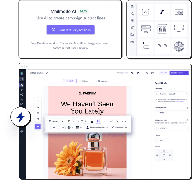
Power up your email design with Mailmodo
Mailmodo offers you two easy ways to design your emails. First, you have the AI Template Generator, which helps you create ready-to-use email layouts in seconds.
Simply type your prompt describing the type of email you want to create such as a welcome message, product announcement, or event invite and the AI will generate a complete template with suggested structure, content blocks, and visuals.

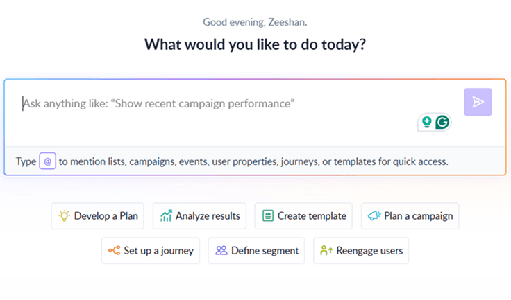
Your AI Assistant for Everything Email Marketing
Mailmodo also offers a no-code editor that lets you design emails with no coding skills. You can start by selecting a pre-made template from our existing template library or create a new one from scratch. The former is advisable if you're just starting and want a foundation to build your template.
Once you choose the template, you can make all sorts of customization to it
Change the brand logo
Play around with different email layouts
Add static and dynamic images
Add different content blocks
💡Quick hack: If you choose to build an email from scratch, you can still get inspiration from our pre-made content blocks.
For a detailed breakdown of how to design an email in our template builder, here's a step-by-step process for you:
💡 Related guide: 12 Best Email Design Software in 2025
Final thoughts
So, now you know how important an email design is. You can follow the best practices discussed in this article and refer back to the examples from leading brands in this article to design better emails.
Along with that thought, Mailmodo is already paving the way for making email dynamic and interactive. Not only that, it is also trying to make the entire process of designing an email seamless and easy. Don’t forget to check out our library of pre-made email templates and get a glimpse into the endless possibilities.