


Chapter - 1
Basics of an email design system
Are you tired of spending hours designing and coding each email from scratch? Do you want to create stunning and consistent email campaigns effortlessly? If so, then you need to know about email design systems.
What is an email design system?
An email design system is a set of guidelines, templates, and assets that ensure a consistent design language and maintain brand identity across all email communications. To create an effective email design system, it's important to take inspiration from other successful brands.
Benefits of having an email design system
The concept of an email design system is simple yet powerful - instead of starting from scratch every time, you have a pre-built framework that is ready to go and optimized for maximum impact. Here’s why you should invest in an EDS:
1. Improve design consistency
By developing your own email design system, you can establish a set of guidelines for your email templates, ensuring that all your emails have a consistent look and feel. This can help to create a more professional and trustworthy image.
For example, the collaborative platform Miro uses a consistent design system in their emails, with a clear hierarchy of information and consistent use of style (image, graphics and email), colours, and fonts in all their emails.

Source: Really Good Emails
2. Boost team efficiency
Having a standardised email design system can save time and reduce errors in the email creation process. With predefined templates and styles, designers can scale email design and create new emails that adhere to the established guidelines.
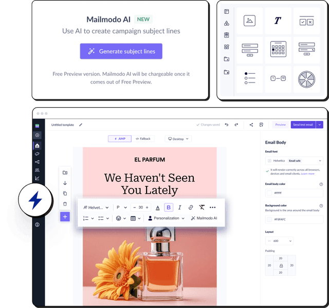
For instance, the email marketing platform Mailmodo allows you to save a created block and reuse that saved block in a new template for creating emails quickly. This dynamic (repeatable) block feature empowers you to personalize content in your newsletters, product recommendation emails, receipts, invoices, etc. It will repeat multiple times, each time displaying different information using the same content block.

3. Increase brand awareness
Using your brand colours, fonts, and other design elements in your emails can reinforce your brand identity and increase brand recall, helping your audience remember your brand when they encounter it in other contexts.
Airbnb's emails often incorporate photographs of hotels and properties which helps to create a strong emotional connection with their customers and increases customer loyalty.

Source: Really Good Emails
Sections of an email
Emails can be simple or complex based on the sections that are used.
The ideal email width can vary depending on the specific context and purpose of the email. However, a general guideline is to keep the width between 500 and 650 pixels. This allows the email to be easily read on different devices, including desktop computers, laptops, tablets, and smartphones. It's also important to keep in mind that many email clients have preview panes that display a limited portion of the email, so it's best to place important information, such as the call-to-action or main message, within the first 320 pixels of the email size.

1. Header
The header section mostly consists of the brand logo, email category (newsletter, invoice, etc.), and user information.
There is no one-size-fits-all answer for the "right" background color and canvas color for an email. It depends on a variety of factors, including the brand's aesthetic, the message being conveyed, and the target audience.
That being said, there are some general trends and best practices that may be relevant in 2023. For example, minimalism and simplicity have been popular in email design for several years, and are likely to continue to be so in the future. This often involves using white or light-coloured background colours, with a limited colour palette and plenty of whitespace. Dark mode is also becoming popular on email clients, which is why you must consider optimizing your email design for dark mode.
Most popular brands have the following dimensional rules to keep their email headers clean.

2. Top fold
The top fold of the body holds the main content for consumption.
3. Email body
The secondary section of the body holds information about side quests that could add to the primary cause or be considered in isolation.
The dimensions of the body section depend on the content and the purpose of the email.
4. Footer
The footer section focuses on brand information and/or social icons. Most brands have the following dimensional rules to keep their emails clean.

5. Email signature
This section includes the brand name, legal information, and contact information. The following dimensions are considered in the case of email signature.

To summarise, these are the best practices you can follow for dimensions of an email.
| Section | Recommended Dimensions | Alternative dimensions |
|---|---|---|
| Header | 600 px X 72 px | [60 - 200 px] X [600 - 800 px] |
| Top fold | Variable | NA |
| Email body | Variable | NA |
| Footer | 300 px X 600 px | [100 - 300 px] X [600 - 800 px] |
Email components
Imagine the email being a canvas for your next art project, which you’re about to start designing. If you wouldn’t recognize your elements going on to the canvas, how would you design them to start with? Let’s dive into the elements to understand their importance.
1. Logo
Placing your company’s logo at the top of the email, in the header section, is a common approach. This ensures that your logo is one of the first things that customers see when they open the email, helping to reinforce brand recognition and establish the sender's identity.
We would recommend a height between 20 px to 36 px for the logo. Ideally, the width should be less than half of the height.

2. Image
Most marketers think of images as an additive to the email, but they can create the direction and motive for action if taken seriously. Let’s take the classic example of the following email.

Here, the header image helps in the visual delivery of the product and also sets the user's mood. Placing the title within the images helps gain more focus as most users observe the image on the first scan. This model also makes the CTA more prominent.
3. Typography
When aiming to ensure that your email appears consistently for your recipients, it is crucial to select a font that is web-safe or email-safe. Email-safe fonts are more likely to be installed on a wide range of computers and devices, which means that they are recognized by web browsers and email clients. Examples of these fonts include Arial, Courier New, Georgia, Lucida Sans Unicode, Tahoma, Times New Roman, Trebuchet MS, and Verdana.
On the other hand, web-safe fonts are also recognized by most email clients and web browsers. Some examples of these fonts are Arial Black, Arial MT Condensed Light, Arial Narrow, Book Antiqua, Calibri, Cambria, Candara, Century Gothic, Comic Sans MS, Consolas, Constantia, Corbel, Franklin Gothic Medium, French Script MT, Garamond, Haettenschweiler, Helvetica, Impact, Lucida Console, Lucida Grande, Palatino Linotype, Papyrus, Segoe Print, Segoe UI, Sylfaen, and Terminal.
To ensure maximum compatibility of your email and web font, it is recommended to use fonts that are email-safe and web-safe.
You can also read our guide on typography to make sure your email copy matches your brand.
4. Brand colors
Using consistent branding colors can help to create a professional and cohesive look and feel for your brand, making it easier to build trust with your audience and achieve your marketing goals. One way to ensure that your brand's colors are consistent across all your email campaigns is by saving the color locally, for which you can follow these steps:
- Identify the color codes for your brand's colors. This could include your primary brand color, secondary colors, or accent colors.
- Use a color picker tool or other software to find the color code for each color.
- Save the color codes in a document on your computer or in a note-taking app for easy reference.
- When designing your email campaigns, use these saved color codes to ensure your brand's colors are consistent across all your emails.
Maintaining sufficient color contrast between text and block color is essential to meet the Web Content Accessibility Guidelines (WCAG) AA level guidelines for accessibility. Here are some tips to achieve this:
- Use high-contrast colors
Choose colors that have a significant difference in brightness or saturation. For example, black text on a white background or white text on a black background provides a high level of contrast.
- Use contrast-checking tools
There are several online tools available that can help you check the contrast ratio between two colors. Some popular ones include Color Contrast Checker, Contrast Checker, and WebAIM Contrast Checker.
- Check contrast ratios
According to WCAG 2.1 guidelines, the minimum contrast ratio between text and background should be 4.5:1 for normal text and 3:1 for large text. Large text is defined as any text that is at least 18pt (or 14pt bold) or 14pt (or 18pt bold) and italic.
- Use accessible color palettes
Choose color palettes that are accessible and meet WCAG guidelines. Color Safe is a tool that allows you to generate color palettes that meet WCAG guidelines. You can choose a base color, and the tool will generate a palette of colors that have sufficient contrast with the base color.
- Test on multiple devices
Test the contrast on different devices, such as desktops, laptops, tablets, and mobile phones, to ensure that the contrast is sufficient for all users.
By following these tips, you can ensure that your email designs are more accessible to all users.
5. Buttons
Buttons are placed to redirect the motive of the user. You have to be strict with the placement of the button. Early or late placement of buttons can lose customers but the right positioning will help you convert more than expected in certain cases. The color of the button is driven mostly by the theme or the logo color to draw attention.
The best practice for button dimensions is as below.

Button styles can be ranked according to their usage in email templates.
By the shape of the button
- Rounded edges button
- Pill shaped button
- Complete Square button
By the style of the button
- Filled button
- Ghost button
- Text only button
By the color of the button
- Blue or ink color
- Brand oriented color
- Black color
- Grey shades color
- White color
By the prominence of the button
- Simple filled or text-only button (most common)
- With Shadow (occasional)
- With Gradient (rare)
- With Image (very rare)
- Combinations (very rare)
The filled button is used as a primary button while the outlined button is used as a secondary button commonly.
The logos are used for a special action, like a share button for Facebook or a tweet button for Twitter.
The icons are used to depict an action. For example, an email icon would imply sending an email to particular address.

6. Socials
Socials can be in the form of specialized buttons or banners intended to drive traffic to social platforms.
7. Whitespace
Whitespace is an invisible element of email, yet it plays a crucial role in designing it. Typically, whitespace is introduced by the padding or spacing element. The height and weight of the whitespace are used to determine the flow of the content.

In this email, the spacing or padding for division in the section used is 45px, while the padding between content elements is 20 or 28 px, hierarchizing copy and visual elements from most important to least important in the order of priority.
8. Divider
This element helps break the flow of the content when there is the least relation between them. This enables users to understand the relationship between sections or cut them from the above content topic. The divider element is more prominent in newsletters than in a marketing, promotional, or transaction email.

Source: Mailmodo
Color also plays an active role in dividing the content and section, as shown in the email above. Most emails use this technique to counter the usage of the divider element.
Email aesthetics
Every element on the email template revolves around orientation, style, and theme to make it aesthetic.
1. Email style
The popular options are among the following and most of the templates fall into one of these categories:
- Clean, Light, Luxury, Classic
- Bold, Creative, Funky, Neon, Vibrant, Typographical, Colourful, Hipster
- Pastel, Retro, Vintage, Rustic
- Line, Geometric, Circle, Round, Arches, and Waves
2. Email theme
The theme of an email depends on its overall appearance, including the use of colours, fonts, images, and other design elements.
A dark visual theme typically features a dark background with lighter text and other design elements, such as images or buttons. This can create a dramatic, modern, and sophisticated look, and is often used in industries such as fashion, entertainment, or technology. However, dark visual themes can be more difficult to read, especially for people with visual impairments, and may not be suitable for all types of content.
A light visual theme, on the other hand, features a lighter background with darker text and other design elements. This creates a bright and airy look, and is often used in industries such as healthcare, education, or finance. Light visual themes can also be easier to read and more accessible for a wider range of recipients. However, they may not have the same visual appeal as a dark theme.
Additionally, you can either have a minimal or a maximal email design system depending on your branding.
Minimal emails tend to have more whitespace and less complicated elements (in terms of visual impression) while on the other hand, modern emails have more elements packed together to show less whitespace among them. Although the whitespace among the elements may be low, but the spacing is enough to be visually impressive.
Email layout
An email layout refers to the design and visual structure of an email message. A well-designed email layout can make your email more engaging, easier to read, and more visually appealing to your recipients. For more information, read our guide on the utility of an email layout.
Types of email layout
Different email layouts can be used to achieve different goals, such as promoting a product or service, sharing news or information, or encouraging recipients to take a specific action, such as signing up for a newsletter or making a purchase.
1. Single column layout
The elements of an email are laid out in a single column-like structure. Most transactional emails follow this structure to present a clean format of emailing style.
Pros:
- Easy content consumption
- The sequence of content is well defined
Cons:
- Finding specific content may require effort to go through the whole content
Use cases:
- Newsletters
- Welcome emails
- Re-engagement emails
- Promotional emails
- Invoice emails

2. Double -column layout
In a double column email layout, there are two columns of content that run side by side, typically with one column narrower than the other. The wider column might include the main content, while the narrower column might include a sidebar with related links or promotional content.
Pros:
- Option of choice
- Hierarchy of content
- Attractive structure of content
- Locating content is easy
Cons:
- Dual-directional flow can create confusion.
- Missing out on content can be witnessed.
- Responsive design is complicated
Use cases:
- Product announcements
- Comparative emails

3. Multi-column layout
In a multi-column email layout, there are three or more columns of content, typically arranged in a grid-like format. The multiple columns can be used to showcase different types of content or to break up a longer message into more manageable sections.
Pros:
- Comparison of content
- Selective content consumption
- Better content delivery
Cons:
- Mobile responsive design is complicated.
- Choice can lead to confusion and hence hinders conversion.
Use cases:
- Product catalogs
- Event invitations

4. Inverted pyramid layout
The elements of emails are structured to represent an inverted pyramid structure.
Pros:
- Grabs attention
- Helps with skimming
- Increases readability
Cons:
- Dependency on content for the intent driving
- This can lead to confusion and hinder conversion
Use cases:
- eCommerce and Marketplace promotional emails
- eCommerce and Marketplace marketing emails
- eCommerce and Marketplace transactional emails


5. Zig-Zag layout
The elements of emails are structured in alternating columns to represent a Z pattern.
Pros:
- Systematic consumption of content
- No loss of content
- Increases readability
- Rapid skimming
Cons:
- The content focus area is limited
- Not great for mobile design
Use cases:
- eCommerce and Marketplace product catalog emails
- eCommerce and Marketplace marketing emails
- eCommerce and Marketplace product introduction emails

 Experiment with different types of layout —single column, double column, hybrid, etc.— to select one that aligns with your branding.
 When choosing fonts, there are various philosophies that designers follow. Here are some examples:
 It's important to ensure that your logo block is visually appealing, and that it accurately represents your brand. You may also want to consider adding alt text to the logo image, which will display in place of the image for recipients who have images disabled in their email client.


