Gone are the days when email design was rigid, inflexible, and boring! The email landscape is changing fast. To remain on top of your game, you should be well aware of trending and popular designs that'll dominate email marketing in 2025. We have collected a list of the 11 most exciting email design trends that are worth trying. These will amaze you. Ready to get your creative juices flowing? Let’s go!
- Platform

- Resources
Learn Marketing

Guides

Email Templates

Email Flows

Ebooks & Reports

Marketing Videos

Newsletter
See More Resources ->
Free Tools
Email Marketing 101 FREE
Read Now ->
11 Email Design Trends That Will Boost Email Engagement in 2026
ByNupur Mittal
Updated:
9 mins read
Updated:
9 mins read
8 Email design trends to follow
These 8 email design trends are the best in the market and you must incormporate them in your future email campaigns to boost your email engagement.
1. Gamification in email
Gamification in email is the coolest trend to see more of in 2023. Not only do they engage readers but also help in generating revenue. So, here are our top 3 predictions for interactive email design in 2023:
• Wordle in email
At the beginning of 2022, Wordle, a word game, took over the internet. Instead of websites, adding such games within the email is unique and creative. Giving users to play games in their emails can be fun.
See for yourself, Wordle in an email by Mailmodo:

Related guide: Email GIFs Guide to Send Stunning Emails
• Spin the wheel
Spin the wheel is an exciting game where you spin the wheel and unlock exciting gifts and offers. Wheel of fortune or spin the wheel is prevalent in emails during the holiday and festive season. Promodo saw a 35% increase in revenue by adding roulette in its holiday email campaign.
Here is our favorite spin the wheel example in an email:

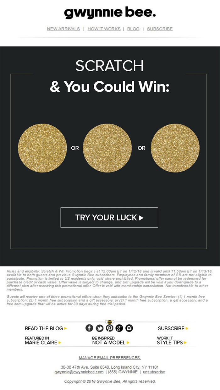
• Scratch cards
Scratch cards are great to create curiosity and excitement in your emails. They reveal information after users scratch them, pushing the reader to interact with the email.
Marketers are using creative scratch card design that blends with the email and gives users an interactive experience right in their inbox.
These scratch cards in the email by Gwynnie bee look like it’s calling you to scratch them and unlock exciting goodies.

Source: By Gwynnie Bee via Email Uplers
2. Bold typography
Bold typography has been used widely in the past few years. It’s because it helps brands put their message to their readers and stand out in users’ inboxes. And we are expecting to see many such bold fonts and font distortions in 2023.
We agree that pictures are worth a thousand words but the combination of fonts can also say a lot if used well. They can make your email headline stand out and grab the user’s attention.
For example, in this email by Zest, they are using font distortion in headline-making it stands out in the email. They used a different color and a not-so-common font to make their point. It’s attention-grabbing, isn’t it?

Source: By Zest via Really Good Email
Here is how Adobe and Epic for kids use font distortion that you can get inspiration from for your next email campaign:

3. Color design trends
Here are two of the most trending color design trends:
• Duotone
The duotone trend is about using a couple of colors in the entire email. This trend has been seen in email marketing due to the retro style that was used in 2021. We expect to see marketers adopting dual tones in email as it reduces unnecessary distractions for the reader and seems very approachable.
A great example of duotone is by the Minor figure where they are using two colors - one for the text and one for the email background. Both colors blend in a way that gives a monochromatic tone. To us, this email is clutter-free and gives a clear message.

• Multi-shade gradients
Another color trend that is going to dominate email marketing is multi-shade gradients. We love how gradients emerge with the email and give it a retro look, and also cut through the noise.
Human minds are programmed to move our eyes from a lighter to a darker area of the gradient. So, gradients help reinforce the visual hierarchy by guiding the eye movement.
These emails by Harry’s, 1973 Ltd. catch eyeballs as the gradient is blending with the images. It gives the entire email a consistent flow.

Apart from using gradients in the email background, you can play around and add it to your CTA button as Instagram did. It helps your CTA stand out and make it prominent.

Source: Google
4. Layout design trends
Get the State of Email 2025 Report
Optimize the right email metrics for higher ROI
With layouts in email, we are seeing different trends but two of the most popular are:
• F-pattern layout
We wouldn’t lie, but the F-pattern layout is among our favorite trends that we want to see more of in 2022. We like the F-pattern because it makes email scannable, and since everything is aligned towards the left, it makes it easy for the human mind to read and understand the content. Another reason for its popularity can be that it’s easy to create.
In this email by Crawless, you can see they have broken down each section by adding a headline and a category on the left. Each section has its own CTA and the email looks easy on the eyes.

Source: Crawless via Really Good Emails
Hims has gone a step ahead and used the F-pattern by aligning images. The text supported by images makes it more engaging and easy to understand the context. They have also added uniform colors to distinguish the sections.

Source: Hims via Really Good Emails
Here is how Lingo and Webflow use the F-pattern to improve user experience and make their email more readable.

• Compartmentalized layout
Creating compartments to highlight different sections in an email is gaining popularity, especially among retail brands. Compartments can be created using lines or shapes, such as putting images within a box.
Zaino, Behave, exhibit this trend with a flair, we would say. They have used lines, pop-up colors to create sections, making each image stand on its own.

5. Arches and waves
In a way, this trend is quite the opposite of compartment email layout as instead of lines and rigid sections, these trends use arches and waves to create flow in the email. These arches and waves work as directional cues and let users transit from one section to the other.
Many brands use this trend to lead users towards the email CTA, as you can see in these emails by Futon. The rounded arch towards the bottom is pointing to the call to action. On the other hand, email by Moment is leading users towards the CTA from the beginning using arches.

These trends are also popular as they help break the myth that email design can be rigid and structured. But with using these unstructured shapes, email gets a smooth flow and transitions from one section to another. Some great examples are these emails by Simmons and Prismatic Plants:

Matt Helbig, Community Manager at Really Good Emails, gives a word of caution - don't use too many arches and waves as it might make the email look cluttered and confusing to the subscriber.
6. Tangible products photography
This trend is about bringing the product to the user’s inbox instead of making them go to the landing page and see the product. So, in a way, it offers users precise and a real-time view of the product they might be interested in.
Such photography offers even intricate details - the color, size, material, etc. Such trends are more prevalent among e-commerce brands as they have a range of products and can offer their users products within their inboxes.
This email by Adidas is bringing this product to life. It makes us feel we are touching the footwear with our own hands.

Source: Adidas via Really Good Emails
Here are some other examples by Fitbit and Camper showing off their product in email:

7. Seasonal scroll campaigns
To enhance their reader's digital experience, many brands are trying long scroll designs in emails. Such emails aim to engage readers by encouraging them to interact. However, creating such emails takes a lot of resources, and accessibility is also of concern. That's why these can become seasonal, especially around holidays or special discounts.
We loved these long scroll emails by Zesti and J.Crew and how they have hooked us to keep on scrolling till the end.

Related guide: What Is Email Accessibility and Why Is It Important
To level up, this email by Action rocket is a fun and enjoyable experience for the email geeks. We loved it and expected to see such creative emails during seasonal campaigns.

How can you experiment with email trends efficiently?
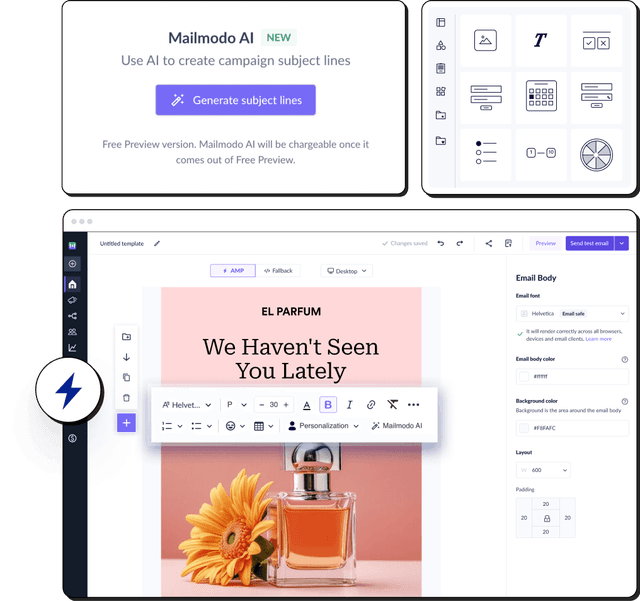
After seeing all these trend ideas, you might want to apply a few of them in your next email send. However, adding each element manually and creating a polished email can take time and effort.
Mailmodo AI Template Generator makes this process faster by creating ready-to-use templates based on your campaign goals and preferred style. From bold typography to modern layouts and gradient backgrounds, it automatically incorporates current design principles.

Your AI Assistant for Everything Email Marketing
Way forward
There you have it. Some of the most splendid trends that you’ll see more of in the coming months. But, don’t sit back and enjoy these trends. Pick up your tools and start designing emails using a free email template builder to experiment with bolder fonts, simpler layouts, and wavier transitions. You can also go through this detailed guide to know how you can create a great email design system with examples.
And while we are on this subject, have you checked out our 7 email marketing trends post yet? It’ll give you a holistic view of how to incorporate these designs in your next email marketing campaigns. Try this lethal combination of trending designs and email marketing today for better results.
What should you do next?
You made it till the end! Here's what you can do next to grow your business:

Get smarter with email resources
Free guides, ebooks, and other resources to master email marketing.

Do interactive email marketing with Mailmodo
Send forms, carts, calendars, games and more within your emails to boost ROI.

Consult an email expert
30-min free email consultation with an expert to fix your email marketing.
You might also like
Enter with an idea.
Exit with a winning email campaign.

Brainstorm email campaign ideas with Mailmodo’s AI assistant
Build precise segments in seconds with AI segmentation
Generate ready-to-use email templates with AI
Experience true AI email marketing automation with Mailmodo
Trusted by 10000+ brands