What is a website heatmap?
Website heatmaps are a graphic representation of website visitor activity and customer engagement. It makes it easy to understand what visitors do when they land on your website. It helps to identify the pages or elements that are getting the least engagement and devise strategies to improve them. Heatmaps are also widely used by agencies offering website design in Dubai to identify UX issues and refine layouts based on real visitor behavior." at the end of first paragraph of this section"What is a website heatmap?
The heatmap can be in grayscale or rainbow colors. Most people prefer the rainbow color depiction as humans generally understand color better than value. The colors in the rainbow heatmap show how people engaged with different areas of the website.
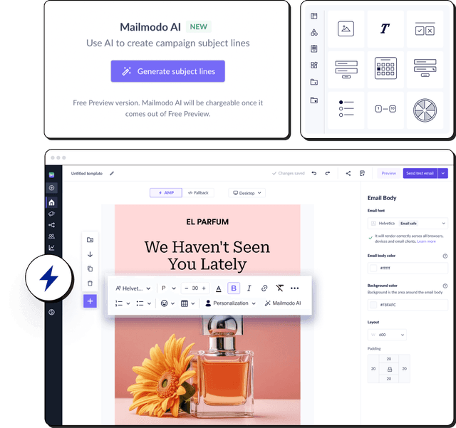
For heatmap examples, consider the heatmap of Mailmodo’s website. The warmer colors like red or orange show the most popular areas. But cool colors like blue or purple denote the least clicked and engaging elements.

Benefits of using a heatmap
Here is how heat maps are helpful and who benefits the most from them:
Helps you understand your website visitors' POV to determine what captures their attention and modify your site to put your most important content there.
Help you find out if people are having trouble finding something on your website or experiencing issues based on mobile devices. By knowing what problems they face, you can fix them to provide a good user experience for your visitors.
You can analyze the performance of your website. Heatmaps help you find out if people are clicking on the important content or getting distracted by other elements on the website. With this data, you can remove the distracting element and place important information in its place.
You can use different heatmaps to help you identify the performance of different KPIs. For example, you can use a click map to find the most-clicked components on your website or use a scroll map to see how far users scroll down on a given page.
The people who benefit the most from heatmaps are:
UX designers can use heatmaps to understand if the design inspires viewers to take action, test usability, and identify behavior patterns.
UX analysts can use heatmaps to analyze the website in an in-depth manner. From this analysis, they can generate actionable insights to improve business outcomes.
Marketers can use heatmaps to understand what grabs the visitor's attention and place the most vital element (like a CTA button or special offers) in the most popular part of the page.
How to create your heatmap?
Here is our four-step breakdown for creating a heatmap for your website.
1. Set goals and choose KPIs
Before you put in your heatmap work, you need to decide why you want to do this analysis in the first place. Do you want to find out the performance of your website? Which pages do you want to analyze? Do you get insufficient website conversions?
Identify the problem area and select which pages you want to analyze; it can be:
The homepage or main landing pages to find out if it gets people to convert, signup, check out other pages on your site.
Top-performing pages to find out what's working well and replicate the same in other pages.
Underperforming pages to find out what's wrong with them and fix the issue to get more interaction or conversion.
Newly created web pages that don't have any data regarding page performance.
Or sections of a particular page, it can be anything.
As for what key metrics you need to monitor, they are mentioned below:
Choosing KPIs is important for deciding the type of heatmap you should create, which is the next step in the process.
2. Decide the type of heatmap to create
Now that you are aware of what you want to track, choose what type of heatmap you want to create. There are primarily two types of heatmaps:
Interaction heatmaps
Attention heatmaps
Interaction heatmaps use tracking codes to record and measure different interactions between a user and a website, like clicks, scrolls, mouse movements, and more. Here are the different types of interactive maps that you can create:
You can use scroll maps to see how far down the page users scroll to determine the ideal web page length and where to put important content on a page.

The red areas in the image show the portion of the page that most people see, and the numbers decrease as it goes down the page. If a scroll map shows red or orange for a large portion of the web page, it doesn't necessarily mean they are engaged and enjoying the content. They are scrolling because they couldn't find what they were looking for.
So use the data from the scroll map to optimize the page such that visitors can read all the important information right at the beginning of the page.
You can use click maps to find out which elements on your site are most or least clicked, revealing where there are navigational issues. And, with data from click heatmaps, you can remove CTAs from areas causing user friction to improve conversion rate.

Ideally, people should only click on buttons and CTAs that you want them to click on. If they click on things like images, text, etc., it means something is wrong, and you might have to change the image or text.
Mouse movement maps are also called move maps or mouse tracking maps. You can use them to find users' cursor movement when navigating through your website. It gives an idea of what people are looking at as they go through your website.
If the heatmap is spread out as shown in the image below, it doesn't mean people are focused on your website. Rather, it means there are many distracting non-clickable elements in the website.

This heatmap also helps you find out frustrated users by showing where people hesitate or hover their cursor on a web page. You can use this data to find out the cause of the friction and remove it.
Attention heatmaps are more complex types of heatmap as they look at what users see when they skim through your website by scanning or predicting their eye movements. This type of heatmap is also called an eye-tracking heatmap.
This type of heatmap uses sensor technology to monitor eye movement, pupil dilation and blinking to analyze which parts of the website capture the user's attention. You can use the data from this heatmap to determine if a web page's design is working well and fix any issues to create a user-friendly layout.
You know what page you want to analyze, what KPIs, and what type of map you want to create. All that's left is to select a heatmap generation tool and set it up. But, there are a lot of heat mapping tools available, so you might want to compare them to find out which one you should choose.
Select a tool that provides a few types of heatmaps, as you might also want several types of heatmaps to do a complete analysis all at once.
Here are some of the most widely used tools you can choose from:
| Tools |
Features |
| Hotjar |
Click, tap, scroll maps, feedback from users. |
| FullStory |
Automatic insights, user session recordings, segmentation, advanced search capacity. |
| Smartlook |
User session recordings, automatic event tracking, click, scroll, mouse movement, and other heatmaps. |
| Mouseflow |
Click, scroll, attention, and movement heatmaps, user session recording, form analytics feature, tracking funnel. |
| Lucky Orange |
Dynamic heatmaps, real-time dashboard, daily email reports, user recordings, live chat, surveys, polls, and conversion funnels. |
| Dragonfly AI |
Real-time analysis of the website, live attention heatmaps, user session recording. |
| Attention Insight |
Attention heatmaps, percentage of attention, competitor analysis. |
| Crazy Egg |
Click, scroll, and other types of heatmaps, segmentation, and analysis of segments. |
Now, as for setting it up and creating a heat map, the process varies depending on what tool you use. In general, you would have to manually add a tag to your sites' code to allow the tool to track your website visitors, and you'll get results after a few days or so. But, this can differ, so check with the tool you use to know more.
4. Analyze the heatmap
You have created a heatmap; let's discuss reading and analyzing it.
Start checking the heatmap once there is a good amount of traffic to your website, as the more data the tool gets, the more accurate its results will be. Once you have generated your heat map, you can filter it based on specific characteristics like country, operating system (OS), traffic source, visitor type, device, date, etc., to get more accurate information on your target audience.
Now that you have filtered the map, you can check if people are looking at or clicking on what you want them to focus on, like CTAs, buttons, etc. You can also ask yourself the following questions to make it easier to find out if things are going well.
- Do people see the important content?
If you have created a scroll map, check the position of the average fold, which is the portion of the webpage that people see without scrolling. If people are not going far past the average fold, it means that people see all the important information in the beginning as soon as they come to the website.
If you have created a click or mouse movement map, check what elements they click on. If it is limited to the clickable elements, the information is clear and accessible. But if it is widely spread across the page, users have a hard time finding the information.
- Are people clicking on the key page elements?
If people are clicking mostly only on the key page elements like links, buttons, and CTAs, then the website design is successful and tells visitors their next step.
- Are people clicking on non-clickable components?
If you see in your click map that people are clicking on non-clickable elements, the design isn't very clear for visitors, and they don't know what is clickable and what's not. Non-clickable elements can be testimonials, photos, titles, text, etc.
- Do people get distracted when browsing?
Look at your mouse movement map and see if the movement is spread across the page or focused on key messages. If it is spread out, it indicates that users are distracted by several elements of your website, so you must remove all the clutter and distracting elements.