3 different approaches for creating mobile email design
Determine which approach best suits your needs and start creating compelling email designs for mobile devices:
1. Scalable design
Scalable design works well across both desktop and mobile. You don't have to code to adjust the table, image sizes, or display, and hide content between the two platforms.
This approach uses a grid system for alignment as well as proportion, single-column layout, and big buttons. Scalable email design is also known as mobile-first or mobile-friendly design.
A scalable design will look like this:

Source: Litmus
2. Fluid design
The fluid design approach uses percent-based sizing to make the width of tables and images adapt to the screen size on which they are viewed. This is similar to what is known as “liquid” layouts on the web.
An example of fluid design is as follows:

3. Responsive design
Responsive design uses CSS media queries to change the layout, adjust the font size, and make images and buttons adaptable to the device's screen size. Many developers & marketers use a responsive email builder to simplify this process, allowing them to create adaptable email templates without manually coding every media query.
This is how responsive email design will look:

Here are some suggestions to help you decide which approach works best for your email campaigns:
- If you have fewer resources and little knowledge of CSS and media queries, it’s best to go for scalable or fluid email design in your email design system.
- A responsive design would be a great choice if you have a CSS and media queries team and a large mobile audience.
Related guide: How to Create Responsive Email Design For Better User Experience
11 awesome hacks to create mobile-friendly email designs
Here are 11 proven techniques to create emails that your mobile users can't resist opening:
1. Keep the subject line and preheader text within the character limit
With a smaller screen, the chances to grab your user's attention diminishes. So, use your subject line and preview text to compel subscribers to click on your email. You only have 35 characters for writing an intriguing subject line and 85 characters for preheader text. Use this to get higher open rates on mobile devices.
2. Go for a single-column layout
We recommend using the single-column layout in your emails because it's easier to create and work well across all email clients. Single column layout is the best approach for the small screen as they accommodate so well and maintain the legibility of email copy. You can also use two-column if the email demands.
Avoid a multi-column layout as they make your email look less appealing and cluttered and don’t impact the reader.
Related guide: An Ultimate Guide to Email Design Layout
3. Aim for bigger, always
Mobile’s small screen size requires larger fonts to help readers view the content without squinting their eyes too much. Here’s what all you need to resize for better legibility:
Apple recommends 17-22px while Google recommends 18-22px.
Note: iOS will automatically resize fonts under 13 px, making them larger on your behalf.
As per litmus, headlines for the mobile device should be 22px+.
Apple recommends a button size of 44px squared, while Google recommends 48px squared.
4. Left-align your email copy
Always left-align your email copy, especially the longer sections, as it improves readability.
Reading relies on visual cues to make sense of each sentence. One such cue is the beginning of each line which works as an anchor for our eyes when jumping from one line.
In the center-line copy (especially long texts), the beginning of the line changes every time, which means the reader needs to do extra work to read your email. But, you spare them by left-aligning your email copy.
5. Avoid navigation bars
The navigation section in an email may not be your best bet for mobile devices. It can make your emails look cluttered, and they might not look readable for the subscribers. You can either reduce the number of links in the navigation bar or remove them altogether to give users a better experience.
6. Let your emails breathe
Nothing makes the reader instantly delete your email than seeing cluttered and space-less texts, buttons, and images. Such emails make it difficult for users to navigate, and they might click on the wrong link or button in haste.
So, ensure that you use enough white space around the clickable elements, images, and in between the paragraphs.
A copy with adequate white space looks less intimidating and more friendly and polished. Thus, inviting the reader in.
- Eddie Shleyner, Foundr of VeryGoodCopy
7. Optimize the email load time
About 3 in 5 users check their email on the go - Fluent 2019.
It means they probably don't want to wait for your email to load, even for a minute. If it does, they will simply close the email and delete it. So, to keep users engaged, make sure your emails load fast. For that:
8. Don’t forget the alt text
Some email clients don't load the images, while many users might have disabled the images. In that case, how do you ensure you get your message across? By adding compelling alt text to images. It makes your email accessible across all email clients and helps screen readers read the email without any problem.
Buttons usually are the email call-to-action you want users to click on. A good practice is to keep a bigger button size and white space around it, which we have already discussed. But, another tip is to let users know that a certain button is clickable. You can do this by underlining it, emboldening the text, or adding a > sign next to the CTA text.
10. Ensure images don’t pop-out horizontally
You must scale the images with the mobile’s screen width to prevent images from popping out of the screen. You can do this by setting the maximum width similar to the mobile’s and setting the height to the auto. The below code will ensure images are at 100% width of the parent container (aka the mobile device), and the height is set to auto, keeping the image proportions correct.
<style type="text/css">

@media only screen and (max-width: 480px){

.emailImage{

height:auto !important;

max-width:600px !important;

width: 100% !important;

}

}

</style>
To help you out, here are the most common screen resolutions/screens width you can use to set the maximum width and height for images:

Source: Statcounter Mobile Screen Resolution Stats Worldwide, Feb 2021 - Feb 2022
11. Test, test, and test
Putting all your money into guesswork will only leave you vulnerable and on the verge of skepticism. So, to avoid such loss, you need to test your emails.
Test whether email elements render properly across email clients.
A/B test slight variations of an email to see which one performs better and then use the winner email to get higher clicks and conversions.
If an email doesn’t render, ensure to send a fallback version for accessibility.
Related guide: Best Email Testing Tools in 2022
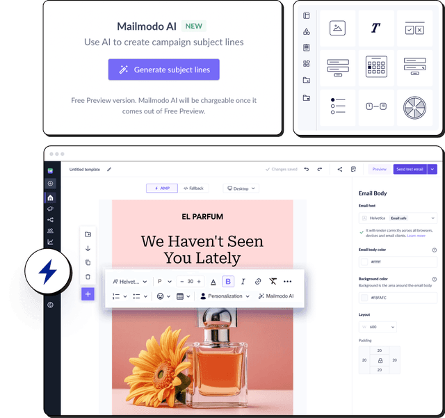
Speed up mobile email design with AI
If you’re unsure which layout or design approach fits your campaign best, Mailmodo AI Template Generator can help. By simply typing in your prompts, it quickly produces a first draft optimized for mobile screens. This lets you focus on refining the content and visuals while ensuring your emails are user-friendly across devices.

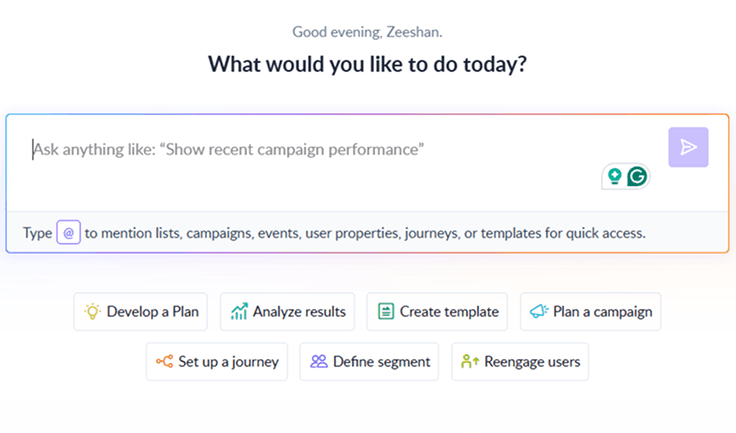
Your AI Assistant for Everything Email Marketing
Conclusion
Low email opens and clicks can send anyone spiraling. To avoid that situation, study your audience's device usage using analytics. Analyze and implement approaches that best suit your business, and give your users a memorable email experience that they can smile about from ear to ear.
If you make your email marketing campaigns accessible and responsive to different mobile devices, your audience will love you, and in return, you will see higher clicks and conversions. Take a lesson from our email accessibility guide where we share the ways Fortune 500 companies make their emails accessible to everyone. If they can do it, so can you.
What you should do next
Hey there, thanks for reading till the end. Here are 3 ways we can help you grow your business:
Talk to an email expert. Need someone to take your email marketing to the next level? Mailmodo’s experts are here for you. Schedule a 30-minute email consultation. Don’t worry, it’s on the house. Book a meet here.
Send emails that bring higher conversions. Mailmodo is an ESP that helps you to create and send app-like interactive emails with forms, carts, calendars, games, and other widgets for higher conversions. Get started for free.
Get smarter with our email resources. Explore all our knowledge base here and learn about email marketing, marketing strategies, best practices, growth hacks, case studies, templates, and more. Access guides here.


