What is an email heatmap?
An email heatmap is a visual representation of how recipients interact with the different elements of your email. This includes their clicks, the portions they scrolled, etc.
You may have different types of heatmaps based on the different kinds of interactions that you can have on your email, like clicks, scroll, mouse hover, focus and more.
Types of email heatmaps
Look at some common types of email heatmaps you can use for your email marketing campaigns.
1. Click heatmaps
Email click heatmaps reveal exactly where the recipients clicked within your emails. This helps understand the effectiveness of the email's CTAs, links and other interactive elements. These heatmaps also show the hotspots of high engagement and the elements that aren’t receiving any clicks.
Scroll heatmaps show how far down the recipients scroll in your emails. This helps understand the engagement of the email content and identify the point at which the recipients lose interest and stop scrolling.
3. Attention heatmaps
Attention heatmaps are a visual representation of how much attention particular sections of your emails receive. This works by tracking the eye movement of the users.
Attention Insight is a company that uses eye-tracking technology to determine where the user is looking on the screen. They also offer predictive eye-tracking technology to provide AI-generated attention heatmaps. They use AI to predict which elements users will most likely notice.
4. Move maps
Move maps track where the users move their mouse. The hotspots represent where the users move their cursor and there is a correlation between where people are looking and where the cursor is. It indicates where people may be looking.
How do you interpret heatmap data?
Heatmaps add a color overlay to the element for each click received. This means the warmer the color is, the higher the number of clicks received on that element. So the blue sections are the coldest, yellow and green portions receive some clicks and the red portions receive the most clicks.
Using email heatmaps it is fairly simple to identify the cold and the hot spots using an email heatmap. This helps understand which CTAs and links are getting more clicks and which ones need to be worked upon. This can help us to place our CTAs and other links better or improve their design.
It also helps us better understand the recipient’s behavior, customer preferences, and what resonates with them. This insight can then be used to provide better and more relevant content that converts better and drives more engagement.
How to improve your emails using heatmap data?
Email heatmaps provide deep insights into understanding customer behavior and their interest. Take a look at how you can use these insights to improve your emails.
1. Identify what is working and what isn’t
Heatmaps help determine if the layout and the placement of the elements in your email work for you. If certain CTAs receive low clicks or are placed in less visible areas, consider relocating them to more prominent positions within your email. You must also identify the most essential elements of your email and determine the hierarchy between them.
2. Place important content in hotspots
You can monitor your emails to identify the hotspots of attention in your emails. Consider placing important sections or CTAs in these hotspots to increase clicks. You must also place your elements to be viewed by recipients. Consider tweaking the placement and layout if the viewers' attention is distributed in an undesired order.
3. Better understanding A/B tests
A/B testing is an integral part of an email marketing campaign for any email marketer. It allows you to compare two versions of an email and determine which performs better. Generally, it provides you with click-through rates, open rates, etc., to understand which performed better in the test.
Including heatmaps for both variations will allow you to determine the right email format, positioning of the CTAs, and other important elements.
4. Optimize the length of your content
If your scroll heatmap shows that your recipients are not scrolling to the end of your email, it may be a sign that your email is too long. Consider optimizing the length of your email to one that is ideal and that most recipients scroll through.
Bonus tip: Experiment with the amount of white space or the designs around your main CTA to make it the main focus point of your email.
How to access email click maps in Mailmodo
While Mailmodo does not offer an email heatmap to show scroll activity, it does have a click map feature so you can easily see where people click and identify the links that receive the most attention.
There are two ways to access this data:
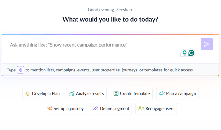
1. Use Mailmodo AI Email Analytics
AI Email Analytics gives you a quick view of click performance and highlights patterns across campaigns. To use it, type your query into Mailmodo AI and the system will surface the relevant click insights automatically. This makes it easier to understand what your audience interacts with and refine your content with confidence.

Your AI Assistant for Everything Email Marketing
2. Search manually
- Go to the Campaigns tab in the left menu and select the campaign you want to review.
- View key metrics on the dashboard, including sent, delivered, opens, clicks, submissions, bounces, unsubscribes and blocked.
- Click the Click Map tab.
- Review the link list on the left and the email preview on the right to see click percentages.
Final takeaway
Email heatmaps have the potential to elevate your email marketing campaigns. By leveraging the visual representations, you can optimize your email design, increase engagement rates and make data-driven decisions for more effective campaigns. Learning about email heatmaps and how to use that information to improve your email campaigns is a plus for email marketers.