HTML email button refers to the button element created using HTML and CSS. In emails, these buttons are often used as call-to-action elements, with links to a website, product page, or survey. These buttons can connect your email campaigns with other marketing channels by redirecting to them.
HTML buttons are crucial for enhancing the interactivity of email campaigns, such as a newsletter, which leads to increased engagement.
The most significant advantage of using email buttons is to increase your CTRs and ROIs. Using hyperlinked text is also an alternative, but since it's not as clear, it can confuse people.
Hence, as we look into the benefits offered by the email buttons, these make it to the top of the list:
Being visually appealing, email buttons attract people's attention and action.
HTML buttons can be optimized for mobile devices, ensuring a seamless and responsive experience across various screen sizes, which is crucial for today's growing mobile users.
Well-designed buttons enhance the beauty of the overall email design and encourage recipients to explore further.
To create an email button for a good user experience, you must first understand its basic anatomy. An email button primarily has four major elements:
Button fill: This is the background color, image, or pattern that fills the button, making it visually attractive and noticeable.
Border radius: This determines the roundness of the button's corners. A general rule of thumb is that the higher the value from clicking a button for the user, the more should be its roundness. So a low-value button should have sharp corners.
Button height: This is the vertical size of the button, balanced with its width for a visually appealing appearance and easy interaction.
Button width: This ensures that the button stands out and is easily clickable. The width of the email button should go properly with the email layout.

Some email clients have images disabled, which can make your campaign look inconsistent across different apps and devices. Bulletproof buttons are designed with HTML code so they are displayed in various email clients. Hence, making it completely bulletproof.
Even though these buttons are coded, they are completely customizable. Bulletproof buttons give your users a better email experience as they load faster and increase the chances of clicks since they appear in all email clients even when the images are turned off.
Image based call-to-action buttons might save you from coding because they can be created in tools like Figma, Canva, or Photoshop.
It's not recommended to use image buttons because
- They are not displayed when images are turned off or your users are using any screen reader
- The inconsistency across users makes it hard to track the campaign's performance.
- Since users don't see the CTA text on the image, they don't understand the context and hence are don't click or engage with your campaigns.
Create beautiful emails in minutes with no-code email editor
Creating universally compatible button styles for all is challenging, considering the vast variety of email renderings. Instead, focus on crafting buttons that function across most platforms. There are diverse methods to achieve this based on your requirements. But here, we will look at how to do it with HTML and CSS:
HTML email buttons offer flexibility in design, allowing for both full-width and fixed-width options based on your email layout preferences.
To implement HTML email buttons, you'll need to code your email template using the following HTML code structure manually:
<a href="mailto:youremail@example.com" class="email-button">Contact Us</a>
If you’re creating a custom mailto link within your email, using a Mailto Link Generator can help ensure links are formatted correctly, reducing errors and you can directly get HTML codes from tools itself.
The CSS styles define the button's appearance. display: inline-block; makes the button inline with the text, padding sets the button size, background-color and color define the button's background and text color; border-radius rounds the button corners, and transition adds a smooth color change effect on hover.
After completing the HTML setup for the email button, you can use CSS to add border and padding to the text. This ensures the entire button area is clickable, not just the button text.
.email-button
{
display: inline-block;

padding: 10px 20px;

background-color: #007bff;

color: #fff;

text-decoration: none;

border-radius: 5px;

font-weight: bold;

transition: background-color 0.3s ease;
}


.email-button:hover
{
background-color: #0056b3;
}
CSS styles determine how the button looks. display: inline-block; aligns it with text, padding sets size, background-color and color decide colors, border-radius rounds corners, and transition adds smooth color change on hover.
In this CSS code, adjust the padding to change the button size, modify the background color for different colors, and customize other properties per your design preference.
Impactful email buttons are visually appealing and function seamlessly. Here are some key guidelines to kickstart your design process:
With inline CSS, you can apply styles directly to the button to ensure consistent rendering across email clients.
Test your email button across various email clients and devices to ensure it displays correctly for all users.
Utilize tables to structure your email buttons, as some email clients do not fully support modern CSS layout techniques.
Design buttons that are touch-friendly and easy to click on mobile devices. A minimum touch target size of 44x44 pixels is recommended.
Adding arrows to the CTA gives the user an extra hint that they should click to move forward.
To make your email buttons interactive and attract the attention of your recipients, it’s important to do away with implementing HTML email buttons:
Do not use JavaScript within email buttons, as most email clients disable JavaScript for security reasons.
Avoid using buttons that are only images. Users won't see the button or its functionality if images are blocked.
Don't overload your email with too many buttons. Focus on one or two primary call-to-action buttons to avoid confusing recipients.
All your favorite brands follow these best practices. Here are some examples from Grammarly, Tripadvisor, Figma, and others:

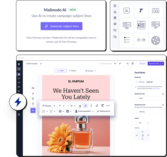
Not everyone loves coding or has the time to code when sending to a wider audience. With an email marketing platform like Mailmodo, you don’t need to worry about coding. You can use Mailmodo’s AI Template Generator that allows you to design complete email templates — including buttons, CTAs, and layout — simply by typing a short prompt.
For example, you can enter Create a promotional email with a blue CTA button for a holiday sale.
The AI will instantly generate a polished, responsive template with a matching button style. You can then customize its size, color, and placement before sending it.

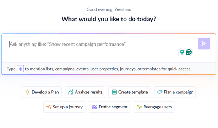
Your AI Assistant for Everything Email Marketing
Final takeaway
As a part of our email marketing strategy, we check the health of our campaign through different indicators. The number of clicks is the most important KPI, as they measure the conversion of recipients from mere readers to active participants. An email button has a major contribution to this conversion.
Throughout this exploration of HTML email buttons, we've delved into their diverse types and dissected the art and science of creating them using HTML and CSS. But these buttons are more than just lines of code. They embody the essence of interactivity. Their visual appeal captures attention, responsiveness promises exposure to all email clients across devices, and the CTA text nudges users to a desired action effortlessly.