What is a banner ad?
A banner ad is a common display ad that uses images to grab attention, market your brand and drive traffic to your website.
Any text, like ad copy or CTA, is usually in the image itself, as you can see in the example below.

When somebody clicks on the ad, they are taken to a landing page where marketers use different strategies to convert them into leads or paying customers.
Also read: A Guide to Landing Page Optimization for Maximum Conversions
However, there are many pros and cons of using display ads like banner ads that you should know before deciding whether banner ads are the right choice for you. So, check out our guide on display ads, where we explain the pros and cons to decide if they are right for you.
Banner ad sizes
Banner ads come in all shapes and sizes. Which one do you choose?
According to the Internet Advertising Bureau (IAB), here are the different banner sizes:
Full banner - 486 x 60 pixels
Full banner with vertical navigation bar - 392 x 72 pixels
Half banner - 234 x 60 pixels
Vertical banner - 120 x 240 pixels
Square button - 125 x 125 pixels
Micro button - 88 x 31 pixels
The full banner (468 x 60 pixels) is the most commonly used banner size among these different sizes. So, it might be good to start with, but the size can depend on where the ad is placed and its purpose. Pick one that suits your needs.
Examples of banner ads
Now that you know about the different banner ads, it's time to look at some real-life examples to get more inspiration.
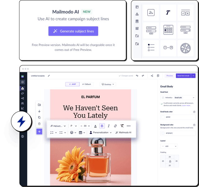
1. Mailmodo
Let's start with one of the Mailmodo banner ads placed on the Really Good Emails website.

Firstly, it targets the right audience because people going through the website are looking for a new idea for their email. And the ad shows a new type of email they can try out.
Next, the ad placement is great because it's where most people will see it.
The ad has a clear CTA that prompts the users to take action.
It has eye-catching imagery with iconic brand colors.
The text is readable.
The copy below the ad explains the unique selling proposition that'll make the users want to click.
2. GoDaddy
Let's move on to other brands; here's a banner ad by GoDaddy.

The ad placement is good.
The image used in the ad is too small. It's not easy to get what the image is trying to convey.
It has a clear and distinguished CTA button.
The copy of the text is very vague. "Succeed online" can apply to any brand, so it's too generic.
Overall, the ad is unclear about what they are selling or trying to tell in the ad.
3. Galleria residencies
Here's a banner ad by Galleria residencies promoting their new luxury apartments available for sale.

It has a large, clear image that is eye-catching. The image can give us a clear idea of what the ad is about.
The overall size of the ad is pretty large, and that is a good thing here as it has more possibility of capturing attention and getting people to click on it.
The text is readable thanks to the big size of the ad.
The ad copy is very clear and tells you exactly what it is, where, and how you can get it.
The ad also showcases its unique selling proposition m which is that it comes ready to move in.
The ad does have a clear CTA "Get quote," but it is not designed well to be the ad's main focus.
The ad also has a pseudo-CTA-like design element, "OC obtained," that can mislead readers.
4. TATA AIG insurance
This is a banner ad by TATA AIG Insurance promoting their international travel insurance policy.

Firstly the size of the ad is way too small, and it doesn't render well.
The small size also makes the text not so readable and makes it look chaotic.
However, the copy by itself is pretty clear and describes what the ad is about.
The CTA also is clear and actionable.
The image is very mediocre, generic, and not eye-catching at all.
Lastly, it has not been targeted to be visible on websites related to their niche. The ad was shown on a completely unrelated page of a fish recipe.
5. Kayak flight
Here's a banner ad by Kayak that showcases the price of flights from different parts of India to a well-known travel destination.

The ad was well targeted as it was placed on a related web page that posts travel content.
The images used in the ad are colorful, eye-catching, and iconic, so it'll help them visualize the destination.
The copy is clear but also feels a bit sparse. There could be a bit more text to describe the offer.
Showing the price in the ad itself is a good idea in this case as it shows the audience exactly what they are going to get.
The CTA copy is clear but not designed well to look like a CTA.
6. Mamaearth
Here's an ad by Mamaearth to promote their ongoing sale and a discount code.

The ad is too small to be noticed by people.
It was not properly targeted as it was shown on an unrelated website about traveling.
It has compelling offers written in the copy but doesn't have an actionable CTA button.
Some of the text in the ad is not readable. It can be both due to the size of the ad and the typography used.
The image is not eye-catching and doesn't show anything related to the brand or its products.
7. Dotdash Meridith
Here's an ad by Dotdash Meredith promoting their advertising and publishing services.

The text is large and readable.
There is a way for people to know what Dotdash Meredith does. It has no text saying what they are offering to the viewers.
The copy is very vague and unclear.
The ad also doesn't have any images that people can see to figure out what the ad is about.
Has a clear CTA but is not compelling enough.
Overall, it's a clear example of what not to do when creating banner ads.
Create your banner ad
Now, there is a lot of information to unpack about different banner ads. But we want to end with one last piece of information about banner ads, and that is that you can create and send banner ads in an email. Crazy, right? Check out our guide on email advertising to know more about how exactly you can place banner ads in the email.
What you should do next
Hey there, thanks for reading till the end. Here are 3 ways we can help you grow your business:
Talk to an email expert. Need someone to take your email marketing to the next level? Mailmodo’s experts are here for you. Schedule a 30-minute email consultation. Don’t worry, it’s on the house. Book a meet here.
Send emails that bring higher conversions. Mailmodo is an ESP that helps you to create and send app-like interactive emails with forms, carts, calendars, games, and other widgets for higher conversions. Get started for free.
Get smarter with our email resources. Explore all our knowledge base here and learn about email marketing, marketing strategies, best practices, growth hacks, case studies, templates, and more. Access guides here.