What is email newsletter design?
Email newsletter design is the visual and structural layout of an email newsletter. An email newsletter design usually includes a branded header, segmented content sections, engaging images, and well-crafted text for readability and engagement.
10 Engaging email newsletter designs
Not all email newsletters are created equal—and their designs shouldn’t be either. The style and layout of your newsletter should reflect its purpose and resonate with your target audience. Whether you're sharing industry insights, launching a new product, or fostering a sense of community, the design should seamlessly complement your content.
Below, we’ve handpicked 10 exceptional newsletter designs, each tailored to different use cases—helping you create newsletters that are as impactful as the messages they deliver.
Black Friday email newsletter
The Black Friday email newsletter template is designed to help marketers maximize sales during the biggest shopping event of the year. Perfect for retailers and ecommerce businesses, this template is crafted to grab attention with bold visuals and drive conversions with compelling copy.
This design includes dedicated sections to showcase your offers, discounts, and key details about the sale. It emphasizes urgency, ensuring your customers are motivated to act quickly. With a clear call-to-action, this template makes it easy for shoppers to take advantage of your Black Friday deals. Simply customize the text, add your product images, and you’re ready to send.

Customize and use this Black Friday email newsletter template.
Home decor email newsletter
The home decor email newsletter template is tailored for marketers in the interior and furniture industry. It provides a visually appealing way to showcase your latest products, exclusive offers, and expert styling tips to inspire your audience.
This template allows you to highlight new arrivals and promotions, encouraging customer engagement and driving sales both online and in-store. With a sleek and professional design, it’s the perfect tool to connect with customers and help them transform their spaces.

Customize and use this Home decor email newsletter template.
Wellness email newsletter
The wellness email newsletter template is ideal for beauty and wellness marketers looking to engage their audience and build lasting relationships. This design focuses on offering valuable content, such as beauty tips, tutorials, and expert advice, to keep subscribers interested in your brand.
With space to highlight exclusive products and promotions, this template helps you drive repeat visits and purchases. Use it to strengthen customer loyalty and stand out in the competitive beauty industry.
 Customize and use this Wellness email newsletter template.
Halloween email newsletter
The Halloween email newsletter template is designed to help marketers engage customers during the spooky season. This festive template is perfect for sharing updates, exclusive promotions, and other Halloween-themed content in a fun and memorable way.
With its customizable design, you can tailor the template to reflect your brand’s personality and meet your audience’s preferences. Its visually appealing layout ensures your message gets noticed, helping you connect with your customers effectively.

Customize and use this Halloween email newsletter template.
Women's day newsletter
The Women’s day email newsletter template is designed to help marketers celebrate the occasion while promoting their products or services. This template features empowering visuals, inspiring quotes, and tailored content to honor the theme of Women’s Day.
It includes space to highlight special offers on popular products like cosmetics, jewelry, or clothing. With its thoughtful design, this template makes it easy to create an engaging campaign that resonates with your audience and supports gender equality.

Customize and use this women’s day email newsletter template.
Valentine's day email newsletter
The Valentine’s day email newsletter template is a perfect fit for marketers looking to showcase their love-themed products or services. Whether you’re in e-commerce, hospitality, or entertainment, this visually engaging template helps you connect with customers during this special season.
Its customizable format allows you to highlight your offerings while spreading Valentine’s cheer. Use this template to craft a heartfelt campaign that drives engagement and sales during the season of love.

Customize and use this valentine's day email newsletter template.
Educational email newsletter
The educational email newsletter template is designed to help marketers build strong connections with their audience while boosting brand visibility. By providing value through curated content, quizzes, surveys, and more, this template keeps your subscribers engaged and loyal.
With interactive elements like carousels and accordions, this template makes it easy for users to engage directly within the email. Use it to stay top of mind and encourage subscribers to take meaningful actions.

Customize and use this educational email newsletter template.
Christmas email newsletter
The Christmas email newsletter template is perfect for marketers spreading holiday cheer while driving customer engagement. Featuring a festive design and interactive elements, this template helps you share promotions, send warm wishes, and highlight holiday-themed products.
With its joyful layout and engaging features, this template ensures your brand stands out during the holiday season. It’s the ideal way to connect with your audience and boost sales.

Customize and use this christmas email newsletter template.
Welcome email newsletter
The welcome email newsletter template is a must-have for marketers to make a strong first impression with new subscribers. Designed to introduce your brand and set clear expectations, this template is the starting point for building a lasting connection.
It provides space to highlight the benefits of your newsletter and express appreciation for your subscribers. With its professional layout, you can ensure a warm and engaging welcome to your community.

10. Weekly email newsletter
The weekly email newsletter template is perfect for marketers who want to maintain regular communication with their audience. It’s designed to deliver curated content, updates, and promotions consistently, helping you stay top of mind.
With its clear structure and engaging visuals, this template caters to a variety of interests while fostering a sense of community. Use it to keep your subscribers informed and encourage ongoing engagement.

Customize and use this weekly email newsletter template.
7 actionable design tips to keep in mind
To help you craft visually appealing and engaging emails, we’ve compiled seven actionable design tips that will elevate your newsletters and leave a lasting impression on your audience.
1. Prioritize a clean layout
A clean layout makes all the difference! Use plenty of white space to keep things visually appealing and avoid clutter. Break your content into sections with clear, bold headings so readers can skim easily. And when it comes to fonts, keep it simple—choose one style for your headers and another for the body text.
2. Stay true to your brand
Your newsletter should feel like an extension of your brand. Add your logo in a way that’s noticeable but not overpowering. Stick to your brand’s colors and fonts to maintain consistency. You can also sprinkle in branded elements like icons or taglines to give it that personal touch.
3. Optimize for mobile devices
Most readers are checking their emails on their phones, so make sure your newsletter looks great on small screens. A single-column layout works best for readability. Keep font sizes reader-friendly—at least 14px for body text and 20px for headings—and make sure buttons are big enough to tap easily (aim for 44x44px or larger).
4. Harness the power of visuals
Visuals can make your email pop! Use crisp, high-quality product photos or behind-the-scenes images to grab attention. Infographics are also a great way to present key information quickly. And if you want to add a little flair, try using GIFs—just don’t go overboard. They work best when highlighting promotions or CTAs.
5. Include compelling call-to-actions (CTAs)
Your CTAs should guide readers to take action. Place them above the fold and at other strategic spots in your email. Use language that’s clear and engaging, like “Shop Now,” “Claim Your Offer,” or “Get Started.” Make them stand out with contrasting colors and don’t forget to hyperlink them.
6. Ensure responsiveness
Your email should look and work perfectly everywhere, so test it on different devices and email platforms. Tools like Litmus or Mailmodo can help. Use images that automatically adjust to screen sizes and steer clear of large files or too many animations, which can slow things down.
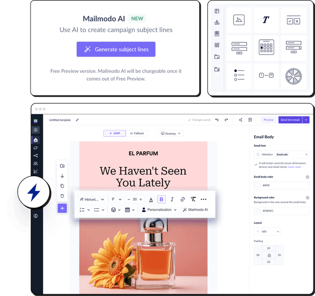
7. Use AI to generate email templates
Creating a professional-looking newsletter can be time-consuming, especially when balancing design, branding, and readability. AI template generators help by producing ready-to-use email layouts that are visually appealing and tailored to your campaign objectives. This allows marketers to focus more on content and strategy rather than formatting.
With Mailmodo’s AI Template Generator, you can provide your campaign goals, brand style, and content preferences, and the tool automatically produces optimized email templates. These templates are fully customizable, letting you adjust visuals, text, and branding elements while ensuring a polished, high-performing newsletter every time.

Your AI Assistant for Everything Email Marketing
Final takeaway
Email newsletters are your secret weapon to captivate, connect, and convert. With the 10 diverse and creative email newsletter designs we've shared, you now have the blueprint to craft campaigns that stand out in crowded inboxes. Whether you’re planning a festive promotion, sharing weekly updates, or inspiring your audience with fresh ideas, these templates are tailored to deliver impact.
Combine these designs with the actionable tips provided—like leveraging visuals, maintaining brand consistency, and embracing interactivity—and you’ll have newsletters that not only grab attention but also drive meaningful results.