What is mobile email marketing?
Mobile email marketing is a marketing method in which a marketer optimizes email campaigns for mobile devices, considering factors like screen size and user experience. It involves optimizing the text, layout, and different design elements so that they provide a good user experience to users who view their emails on their mobiles. With the increasing use of smartphones and tablets, having a strong mobile email marketing strategy is crucial for businesses to reach their target audience effectively.
Why should you optimize your email for mobile devices?
Optimizing your emails for smartphones and tablets is no longer a "nice to have" – it's a strategic imperative. Here's why prioritizing email optimization for mobile devices is a smart move to make:
Better accessibility: Mobile optimization isn't just about convenience – it's about inclusivity. By ensuring your emails are mobile-friendly, you reach a wider audience, including those who primarily rely on mobile devices.
User experience: A negative user experience can have a ripple effect, impacting brand value, return on investment (ROI), and even market positioning. Emails that render poorly on mobile devices can lead to frustration, hindering conversions, and potentially damage the perception of your products or services. Conversely, a seamless mobile experience fosters trust and satisfaction, ultimately driving sales and revenue growth.
What are the best practices for designing mobile-friendly emails?
Prioritizing responsive design guarantees seamless viewing across various devices and screen sizes. Below are the best practices and a checklist for planning a mobile-friendly email marketing campaign.
1. Make your emails responsive
Responsive design ensures your emails render flawlessly on any screen size, delivering a seamless experience that keeps your audience engaged. It utilizes CSS media queries, a coding technique, to automatically adjust your email's layout, fonts, and visuals based on the device it's being viewed on. No more zooming in and out for readers on mobile!
2. Have a single-column layout
Utilizing a single-column layout is advantageous for establishing a clear hierarchy and enhancing readability. This streamlined email design makes the content ideal for concise communication, such as welcome messages, account updates, or announcements.
Checklist for mobile-friendly email campaigns
Before launching your mobile email marketing campaign, ensure its success with the following checklist:
Optimize email load time for swift engagement
Left-align your email copy for improved readability
Design for both portrait and landscape views to accommodate all users
Make CTAs and social media icons touch-friendly
Test your emails across various devices to ensure compatibility
Monitor subject line and pre-header character count for optimal display
| Device |
Character count |
| Android Yahoo app |
45 |
| Android Gmail app |
30 (it varies based on the length of the subject line) |
| Android native email app |
40 |
| Windows mobile |
40 |
| iOS Yahoo app |
50 |
| iOS native email app |
90 |
| iOS Gmail app |
50 |
Mobile optimization is crucial for reaching users on the go. By ticking off these checklist items, you can effectively engage your audience and drive results.
Different variations of an email design mobile vs desktop
After completing the ideation, strategy, and design phases of an email campaign, thorough testing is crucial. Don't settle for designs that dazzle on desktops but fall apart on smartphones. It's essential to ensure compatibility across devices, especially mobile. Below is one such reference illustrating the disparities in email appearance between different devices.
Now, let's understand the diverse variations highlighting how email design appears on mobile compared to desktop.
Variation 1 - Multi-column in desktop vs stack 1/2 in mobile
Illustrated here is the seamless transition from a multi-column layout on desktop to a stacked layout on mobile. On the desktop, the email features an image with a concise description and CTA buttons on its right side. On mobile, it adjusts to showcase a clear headline, followed by the image, description, and easily accessible CTA buttons. This adaptability ensures optimal responsiveness.
Variation 2 - Multi-column in desktop vs stack 2/1 in mobile
Another strategy to enhance responsiveness on mobile devices is showcased here. On mobile, the same email design shifts to a 2/1 stacked layout, prioritizing a clear headline, description, CTA, and then an image.
Variation 3 - Multi-column in desktop vs side-by-side in mobile
This approach simplifies email responsiveness without sacrificing content. The email maintains its effectiveness across devices by omitting images and focusing on using elements (icons) and clear and concise content with prominent CTAs.
Variation 4 - Full-width image in desktop vs scale down in mobile
Adjusting image sizes based on device proportions enhances email aesthetics and functionality. For instance, a 100% width image on the desktop can scale down to 50% on mobile, ensuring an engaging experience for users.
Variation 5 - Full-width image in desktop vs same width image in mobile
Here's another winning tactic: maximize visual impact on both desktops and mobile screens with full-width images that seamlessly adjust. This ensures a consistent brand experience while maintaining structural integrity. Remember, strong visuals reinforce your message and brand identity. The experience is showcased below:
Variation 6 - Hiding image blocks in mobile
Simplicity is key to mobile responsiveness. By omitting image sections and focusing on clear, concise content, your message remains prominent and easily digestible on all devices.
Following these variations’ examples and optimizing emails based on devices will undoubtedly lead to better conversion rates and higher engagement levels.
💡 Related guide: 11 Must-Know Mobile Email Design Tips to Keep Your Subscribers Happy
Key metrics to track
When it comes to mobile email marketing, go beyond basic open rates by tracking how your emails perform across different mobile devices. This unveils which audience segments find your content most engaging on the go. Additionally, by analyzing mobile vs. desktop open rates, you can gain valuable insights into user behavior. This intelligence allows you to segment your email list based on mobile device preferences, enabling you to tailor future campaigns for maximum impact, especially if your audience checks their phones first thing in the morning and through A/B testing different email campaigns with mobile interaction in mind.
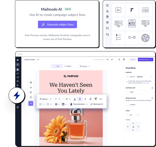
Start designing a mobile-friendly email with Mailmodo
You already know emails optimized for mobiles are game-changing. If you use Mailmodo, you can craft visually appealing emails for your marketing campaigns by selecting a pre-made template and customizing it effortlessly using its intuitive drag-and-drop email builder. It also enables you to create stunning interactive and AMP-powered emails that provide more functionality to your emails, like allowing recipients to submit feedback or rate your services, all within the email.
If you’ve never heard of it, send yourself a sample AMP email by providing your email below.
You even get a 21-day free trial when you sign up. So, start creating attractive emails and start sending them to users both on desktops and on mobiles.


