Before diving into specific examples, it's essential to understand the key elements that make a newsletter sign-up form effective. By incorporating these elements into your form, you can maximize your chances of capturing email addresses and engaging your audience.
1. Simplicity and minimalism
Simplicity is often the key to success when it comes to sign-up forms. Overwhelming visitors with too much information or complicated design can deter them from subscribing. Keep your record clean, concise, and easy to navigate. Avoid clutter and focus on the essential elements that will entice visitors to sign up.
2. Clear value proposition
Communicate the benefits of signing up for your newsletter. Explain what subscribers can expect to receive, such as exclusive offers, valuable content, or insider updates. Highlighting the value they will receive will increase their motivation to provide their email address.
3. Consistent branding
Maintain consistent branding in your sign-up form to establish trust and reinforce your brand identity. Use your logo, brand colors, and fonts that align with your overall brand aesthetic. Consistency creates a cohesive user experience and fosters familiarity with your brand.
15 Inspiring newsletter sign-up examples
Now that we understand the key elements of an effective sign-up form, let's explore inspiring examples from various brands and industries. These examples showcase different strategies and design approaches that have proven successful in capturing email addresses and engaging subscribers.
1. Really Good Emails

This newsletter sign-up pop-up from Really Good Emails effectively balances transparency and engagement. Titled "Can we be honest?", it starts with a casual and approachable tone, inviting users to share their email address to receive "the best email designs and links twice a week." The form is minimalistic, requiring only a name and an email address, ensuring simplicity and ease of use.
What sets it apart is the inclusion of a privacy policy statement that acknowledges email tracking, offering transparency and fostering trust. The call-to-action button, "Subscribe To Our Newsletter," is bold and clearly indicates the purpose, eliminating ambiguity. The design is clean, with ample white space and a professional layout, making the sign-up process seamless and user-friendly.
2. Hustle Panda

Hustle Panda's sign-up form effectively addresses a common subscriber concern: email frequency. By clearly stating how often emails will be sent, it alleviates worries about inbox overload, fostering trust and encouraging more sign-ups.
The design thoughtfully incorporates a bamboo background, a subtle yet meaningful nod to their brand name, "Panda," further reinforcing their identity and enhancing the overall user experience.
3. Mailmodo

Mailmodo’s newsletter sign-up form combines clarity and functionality to deliver a compelling experience. The headline, **“Monthly ideas to elevate your email campaigns,**” immediately communicates value, capturing the interest of users looking for actionable email strategies. The description reinforces this by highlighting the newsletter's focus on creative, practical tips delivered monthly.
The form also builds trust and social proof by emphasizing a “growing community of 10k+ subscribers” with a friendly visual of avatars. Its simplicity is enhanced by the promise of being “Free forever” and delivered “once a month,” addressing potential hesitations about cost or inbox overload. The clean design, straightforward input field, and clear CTA button make it easy for users to subscribe without distractions. This form effectively combines usability with an appealing value proposition.
4. Young & Co
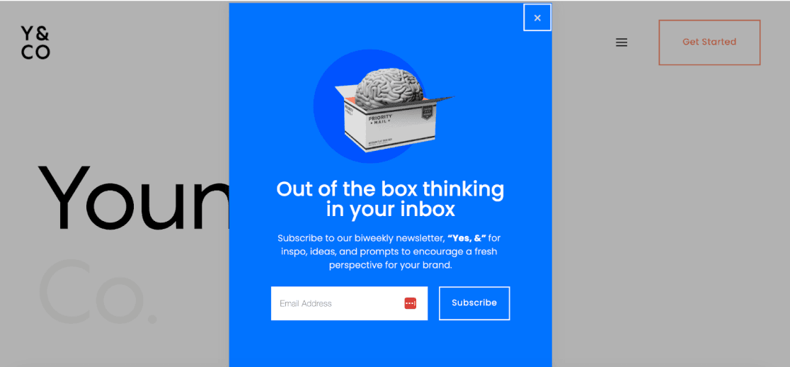
Young & Co, a branding agency, features a pop-up newsletter sign-up form that seamlessly integrates elements of its website design. The form uses the agency’s signature blue color, which stands out against the background, creating a striking visual contrast.
The GIF of a brain entering a box might seem unusual at first glance, but it perfectly aligns with the concept of the agency’s newsletter, thinking out of the box. The imagery and animation reinforce the creative, thought-provoking nature of the brand, while the headline’s wordplay adds an element of intrigue and meaning.
5. Tasty

The Tasty newsletter sign-up form is simple yet vibrant, reflecting the brand's playful and engaging personality. The header "Get the Tasty Newsletter" directly informs users about the purpose of the form, ensuring clarity. The email input field is labeled as "required," streamlining the process and emphasizing its necessity.
The bold pink "Sign up" button stands out against the dark background, making the call-to-action unmistakable and enticing. Additional trust elements, such as the mention of Google reCAPTCHA, privacy policy, and terms of service, reinforce the site's credibility and ensure users feel secure sharing their information.
Below the sign-up form, the inclusion of social media icons encourages users to explore Tasty's presence across other platforms, subtly enhancing their engagement.
6. Nerd Fitness
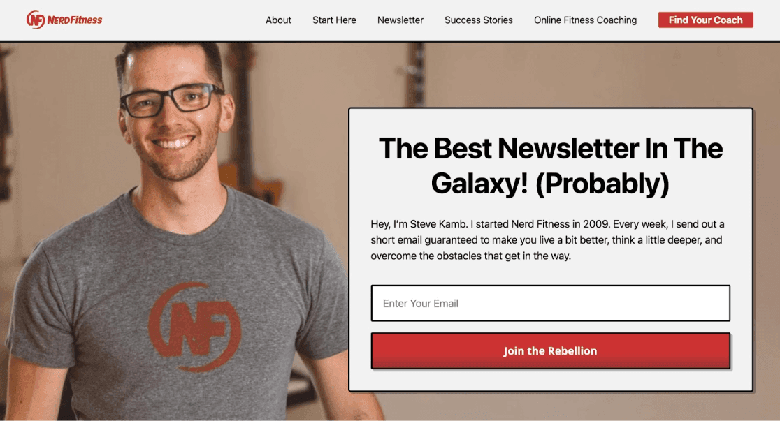
The Nerd Fitness newsletter sign-up form is a masterclass in blending personality with functionality. From the moment you land on the page, the playful headline, "The Best Newsletter in the Galaxy! (Probably)," grabs your attention with its quirky, confident tone, perfectly reflecting the brand’s personality. This light-hearted claim sets the stage for an engaging, community-driven experience.
Adding to the charm, the call-to-action, “Join the Rebellion,” transforms subscribing into a pledge to be part of a larger movement—a close-knit community. The use of a first-person narrative, accompanied by an image of the CEO, makes the experience feel personal and conversational, as though the CEO is speaking directly to you rather than the brand. This human touch strengthens the connection with potential subscribers, making the invitation even more compelling.
7. Marginalian

This newsletter sign-up page uses a poetic and captivating narrative to engage visitors emotionally, blending a sense of wonder with its call to action. The Marginalian Sunday Newsletter is described as a source of depth and inspiration, offering readers a refuge from the distractions of social media. The subscription is free and ad-free, emphasizing its value for thoughtful and undisturbed reading.
Marginalian features dual offerings, catering to diverse reader preferences. The Sunday newsletter provides weekly inspiration, delivering the most enriching and thought-provoking reads in a focused and distraction-free format. Complementing this is the midweek newsletter, which dives into archival explorations, resurfacing timeless essays from a vast collection.
8. Forbes
 Source: Forbes
The Forbes newsletter sign-up page offers a highly customizable experience, allowing users to choose from a wide variety of newsletters tailored to their interests. From Forbes Daily for daily updates on news and exclusive insights, to specialized options like ForbesWomen, focusing on female entrepreneurs and leaders, and CryptoCodex for blockchain enthusiasts, Forbes ensures there’s something for everyone.
Each newsletter comes with a clear description of its content and frequency, empowering users to subscribe only to the newsletters most relevant to them. This approach enhances user satisfaction and engagement by delivering curated content directly to their inbox.
9. Kurzgesagt

The Birb Nest Newsletter sign-up form stands out with its playful and visually engaging design, featuring vibrant bird illustrations that immediately capture attention. It invites users to subscribe with a promise of exclusive behind-the-scenes content and updates on new products from Kurzgesagt.
The form emphasizes simplicity and transparency, making it easy to enter an email address and reassuring users with clear data processing and unsubscribe options. This approach effectively combines charm with clarity, creating an inviting experience for subscribers.
10. Demand Curve
 Source: Demandcurve
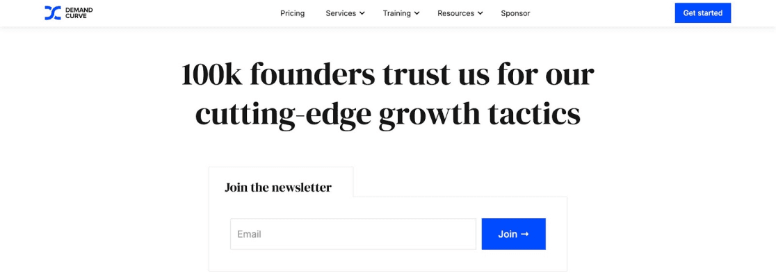
Demand Curve’s sign-up form effectively promises weekly tips and proven growth tactics tailored for startups, delivering immediate value to potential subscribers. It builds social proof, showcasing a strong trust of 100k founders.
The form is designed with simplicity and cleanliness in mind, offering an intuitive user experience without unnecessary distractions. This straightforward design, coupled with its compelling value proposition and social validation, makes it highly effective in encouraging sign-ups from ambitious entrepreneurs looking to grow their businesses.
11. TechCrunch
 Source: Techcrunch
TechCrunch provides customization by allowing users to choose from multiple newsletters, ensuring relevance and increasing engagement. This flexibility respects the subscriber's preferences and adds value.
This type of sign up form gives them detailed information about what each newsletter provides.
12. Jules Acree

Jules Acree’s sign-up form combines both aesthetics and functionality, offering a clean and inviting design. The call-to-action button, “Join 80k mindful readers,” creates a sense of community and social proof, encouraging visitors to subscribe. The form also asks for the first name of subscribers, which is later used for personalized communication, enhancing the user experience.
By offering valuable content like “Slow Brew Sunday” in exchange for subscribing, the form not only entices readers but also ensures they feel part of a larger, mindful community.
13. With Grace and Gold

The With Grace and Gold newsletter sign-up stands out with its elegant and inviting design, perfectly reflecting their brand's aesthetic. It combines clear messaging, a warm tone, and a value-driven approach, encouraging visitors to join by emphasizing the exclusive tips, insights, and resources they’ll receive.
It feels like a personal invitation to grow your business with confidence and grace.
14. Varley
 Source: Varley
When visitors land on Varley’s website, they are greeted with a sleek and minimalistic lightbox popup. The design is deceptively simple yet highly impactful, leveraging a clean black-and-white color scheme paired with a striking, full-color image. This thoughtful contrast draws attention immediately without overwhelming the viewer.
To entice sign-ups, the popup offers a compelling incentive: a 10% off coupon for new subscribers. This small but effective nudge is designed to win over hesitant visitors, encouraging them to join the mailing list while providing immediate value. The design and offer work seamlessly together to create a polished and persuasive sign-up experience.
15. The New Yorker

The New Yorker’s newsletter sign-up form is as refined and engaging as its content. With a minimalist design and clear typography, it emphasizes the value of staying informed with expertly curated stories, commentary, and insights.
16. Claspo

Claspo is an on-site conversion platform that helps marketers turn newsletter sign-up forms into web experiences that simply convert. Instead of a one-size-fits-all form, you can launch CRO-engineered templates like lightboxes, slide-ins, sticky bars, and embedded signups - then tailor each experience with precise targeting and triggers based on traffic source (UTMs), location, device, and on-site behavior. To lift opt-in rates further, Claspo also supports interactive mechanics like gamified opt-ins, making your offer feel more engaging while staying fully on-brand. Everything is built for no-code execution, so you can publish, iterate, and A/B test quickly without waiting on developers.
Conclusion
Newsletter sign-up forms play a vital role in growing your subscriber list and engaging your audience. By incorporating key elements such as simplicity, clear value proposition and consistent branding, you can create effective sign-up forms that drive results.
Draw inspiration from the newsletter sign-up form examples we’ve explored and design a compelling form that captures email addresses and fosters meaningful connections with your subscribers. So, start creating your high-converting sign-up form today and watch your subscriber list flourish.




 Source:
 Source:
  Source:

 Source:


