
- Platform

- Resources
Learn Marketing

Guides

Email Templates

Email Flows

Ebooks & Reports

Marketing Videos

Newsletter
See More Resources ->
Free Tools
Email Marketing 101 FREE
Read Now ->


Audit and optimize your templates for responsiveness
What will this help with?
Ensure emails render correctly across devices without breaking.
Makes the reading experience better.
What are responsive email templates?
Responsive email templates are templates that emails render properly on various devices and screen sizes. Across different devices (laptop, tablets, mobiles), the layout and rendering of different components changes due to change in screen size. If your template isn't responsive, it will break on some devices, making the email difficult to read or understand.
How to audit and optimize your email templates for responsiveness?
Email template responsiveness depends on several factors. So, here is a list of things you can do to improve your templates:
Make sure your templates are tested for various device-width. To do this send a test email to different devices.
View the test email on mobile, tab, and desktop devices to understand where your email breaks.
💡 Tips
Your ESP might have a preview mode for this. You can use that as well.
Tools like Litmus or Email on Acid also help to check the responsiveness.
You might have to work with your email developer, ESP, or designer to fix these issues.
Ensure that your ESP has ways to fix basic responsiveness issues.
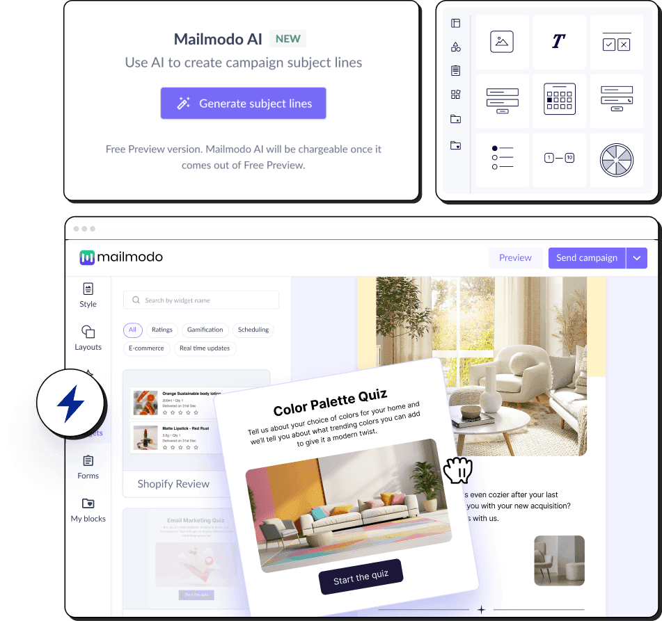
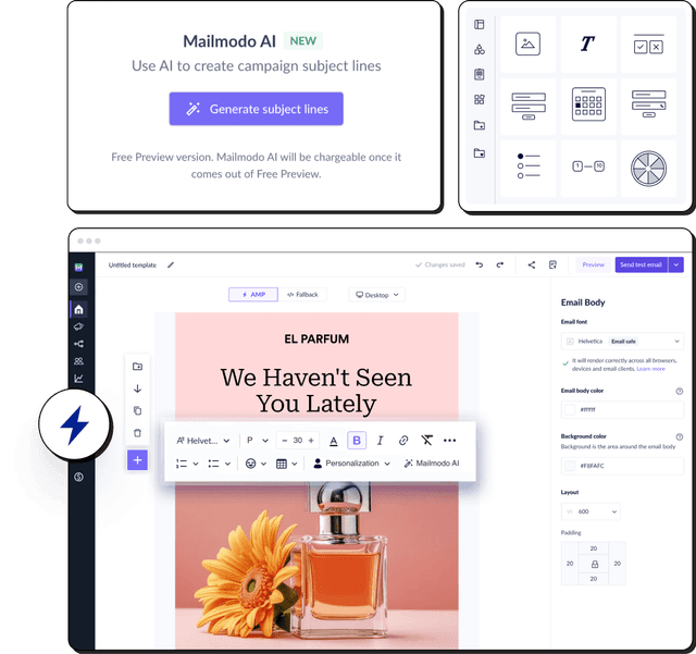
How to fix responsiveness issues with Mailmodo?
With Mailmodo, you can check your email templates for responsiveness and fix errors on-fly. You can even check your templates rendering for various devices and viewports.
- Preview templates on various devices: With the preview feature, you can check how the email renders on desktop and multiple mobile screen sizes.

Making images responsive: For mobile display, you can choose your images to be displayed in full width or to be scaled down.
Making multi-columns responsive: Stacking columns makes the email content render properly on mobile and easy to read. For example, this block is set to stack horizontally in the desktop view and vertically in the mobile view.

- Show/hide blocks in mobile or desktop: You can also use the show/hide feature in different blocks on different devices. This becomes important if you have device-specific CTAs and to make your email design responsive across different devices.
For example, if you have a CTA saying, “Download from the App Store,” this CTA will only be relevant to mobile users, and thus you can hide this CTA from the desktop view.
What you should do next
Hey there, thanks for reading till the end. What now?
Complete the task with Mailmodo Take action and complete the task to improve your email performance using Mailmodo. Try it for free for 21 days.
Join the challenge If you want to get daily emails with actionable tasks with step-by-step instructions to stay motivated to improve your email performance then register for the the challenge here.
Need some help? If you have any questions about the task, ask us on our Slack community and get answers from experts. Join the community here.


You might also like
Get 3X email conversion
with Mailmodo

Create & send interactive emails without coding
Put revenue on auto-pilot with pre-built journeys
Save time with AI-powered email content creation
Experience world’s only interactive email marketing platform
Trusted by 10000+ brands